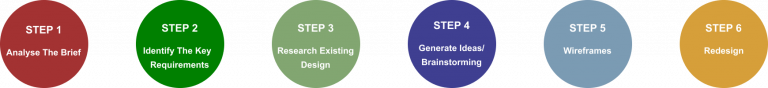
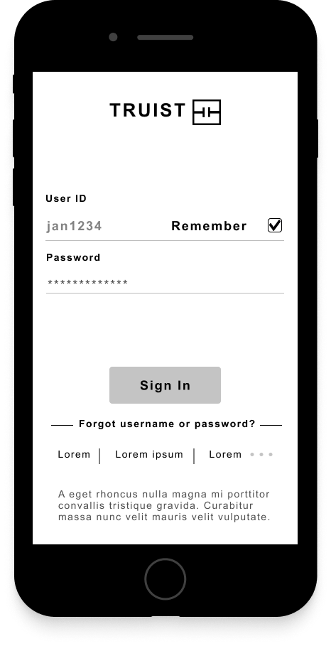
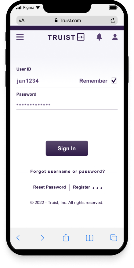
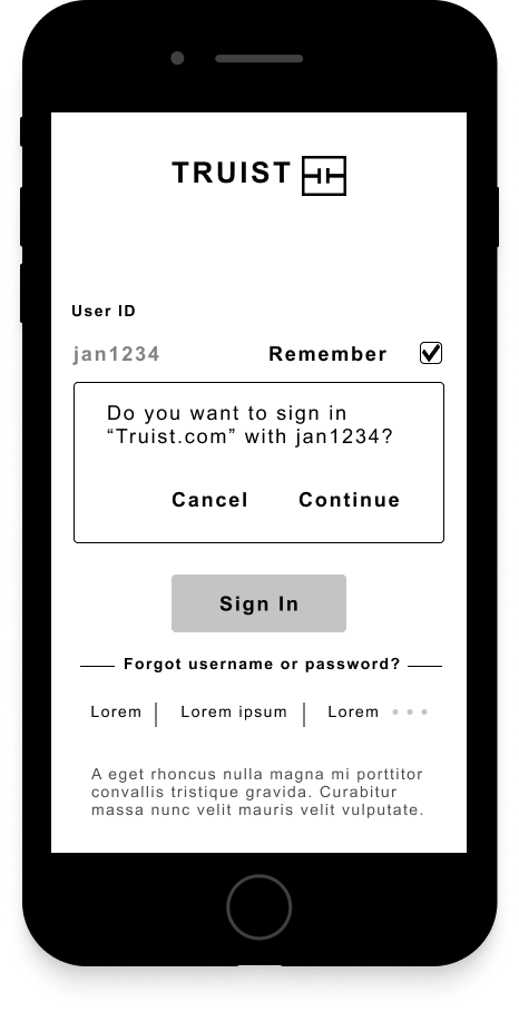
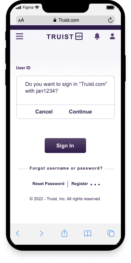
Technology is constantly evolving, and digital banking usage has increased in the past decade but even more so due to the ongoing pandemic. Unfortunately older users and their wants/needs are sometimes overlooked.
Providing a mobile-first design approach, this app will use simple design elements (easily viewable) and provide logical paths to follow, making usage easy, accessible, and enjoyable.
* For the purposes of this redesign, iOS devices are showcased throughout.
What?
Redesign the interface of the web app – log in and features.
Who?
Focus is on older users (50+) who want an enjoyable digital banking experience via using the app.
Why?
So that users can have a reliable and useful digital banking experience that meets and fulfills their needs.
Where?
At home or anywhere – used on various devices.
When?
Users can use this application when they want to check their account balances and complete tasks that are relevant to them.
Duration:
Users want a simple and easy-to-use interface that meets and fulfills their needs. We will know this to be true once they complete task and are satisfied with process.
Screenshots and/or information about the existing log in and interface design as well as branding. The existing branding of Truist is dark and I wanted to enlighten the web app to reach a wider range of audiences, especially older ones who may have visual impairments.
Technology is constantly evolving, and digital banking usage has increased in the past decade but even more so due to the ongoing pandemic. Users 50+ and their needs, are sometimes overlooked as these users want a simple and easy-to-use interface that meets and fulfills their needs.
Providing a mobile-first design approach, this app will use simple design elements (easily viewable) and provide logical paths to follow, making usage easy, accessible, and enjoyable.
* For the purposes of this redesign, iOS devices are showcased throughout.
What?
Redesign the interface of the app – log in and features.
Who?
Focus is on older users (50+) who want an enjoyable digital banking experience via using the app.
Why?
So that users can have a reliable and useful digital banking experience that meets and fulfills their needs.
Where?
At home or anywhere – used on various devices.
When?
Main features of Truist.
Sign in with Face or Touch ID from any device.
View spending habits for the week, month, or the year.
Easily search and view stored checks and their images.
Simple dashboard right at your fingertips!
Clickable prototype using Figma.
Implementing Design Thinking, the following stages were taken to conduct and complete the redesign.
Screenshots and/or information about the existing log in and interface design as well as branding. The existing branding of Truist is dark and I wanted to enlighten the web app to reach a wider range of audiences, especially older ones who may have visual impairments.
The following method below were used to get a better understanding of the pain points that consumers have with banking. Participants vary in socioeconomic status, gender, experience, and location.
A common frustration with consumers and their online banking experience is wanting sensible digital journeys and a human touch element.
To test my hypothesis, I need more information on what users are doing, feeling, and thinking about online banking.
I conducted 1:1 interviews with users from various age ranges and backgrounds to get a better insight into how they go about online banking. My goals are the following:
Meet Lucy, a Persona that I created to further simplify my research findings from the User Interviews.
To help build empathy for Lucy, I created User Stories and User Flows to display her goals.
Age: 64
Occupation: Retired
Education: Bachelor’s
Location: New York City
Status: Married – Children
“Some digital banking apps are not accessible, secure, flexible, user-friendly, or simple.”
Objective
As a frequent digital banking user, I want to be able to see various activities that are happening on my account and view checks so that I can keep tabs on my spending behavior.
Lucy’s User Journey was essential for this phase. This is where I begin to wireframe the following:
A Mood board was implemented to organize the redesign project’s inspiration, create style and aesthetic consistency, and to refine the redesign before diving into the actual design process.
Truist fashions a signature color (purple) that stands out as:
These redesign images are airy, simple, human, and personable to create a sense of independence/self-suffenciency which is the theme for the redesign project.
Below, you’ll find the Design System for the redesign of Truist.
2 fonts were chosen for this redesign and to help demographics with visual impairments:
Arial which is easy on the eyes and is an existing type for Truist.
Georgia pairs well with Arial and has a faster performance when loading.
Clickable prototype using Figma.