To design and implement a financial planning feature that allows users to track their income and expenditures, and manage their budget(s).
AUDIENCE
Lives in the US
Male & Female
22 – 34 yrs of age
TOOLS
Figma
Zoom
Optimal Workshop
Plan Ahead is a simplistic budgeting web app feature for anyone wanting to track and budget their finances from any and everywhere.
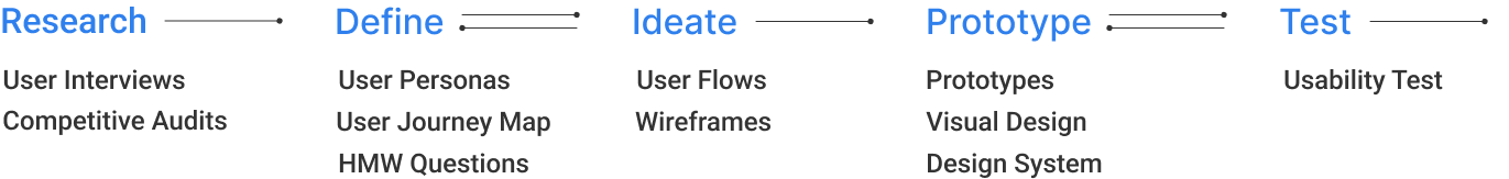
My Design Process
RESEARCH
The following method below were used to get a better understanding of the pain points that consumers have with tracking their income, expenditures, and manage their budget(s).
Participants vary in socioeconomic status, gender, experience, and location.
Questions:
How comfortable are you with budgeting or setting budgets?
How much time do you dedicate to budgeting?
What are some of your concerns with a budgeting feature?
INTERVIEWS
QUALITATIVE/DIRECT
We conducted 3 one-on-one interviews with users from various age ranges and backgrounds to get a better insight into how they go about budgeting their finances. My goals are the following:
Inform the design project.
What the pain points/frustrations users have with budgeting their finances on web apps.
Understanding users wants and needs.
Timothy, 34 | Planner | Lives in North Carolina
"I want a feature that lets me do my budget in a formant that goes with how my brain works."
Stefanie, 30 | Stylist | Lives in Miami, FL
"I like having options. "
Thomas, 28 | Teacher | Lives in New York City
"Doing budgets on pen and paper is great, but it's obnoxious to pull out a notebook when I am so used to using my devices."
FINDINGS
USERS WANTS & MOTIVATIONS
Friendly user interface
A simpler way to budget, plan, and manage finances.
Can use anywhere.
HYPOTHESIS
Users are looking for a simple and easy-to-use budgeting feature and we’ll know this to be true once they can track and manage their own everyday expenditures.
We will know this to be true once they complete task and are satisfied with process.
COMPETITIVE AUDITS
METHOD: COMPETITIVE ANALYSIS
What platforms exists already? How can we turn what’s missing from these platforms into our user’s goal?
We conducted a competitive analysis to see what our competitors in the market are doing. We wanted to compare the value and customer satisfaction delivered by our competitor’s products, prices, and channels with our current situation.
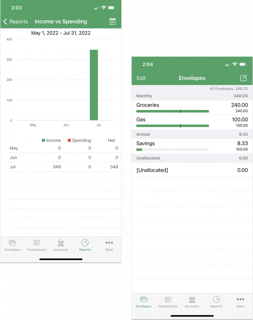
Goodbudget is a personal finance app perfect for budget planning, debt tracking, and money management.
Apple Store rating: 4.7
Rated 4.7 out of 5
Google Store rating: 4.5
Rated 4.5 out of 5
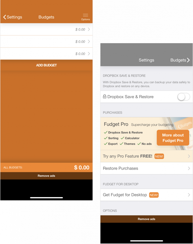
In Fudget’s ultra-simple design, you make lists of incoming and outgoing money and track your balances.
Apple Store rating: 4.8
Rated 4.8 out of 5
Google Store rating: 4.6
Rated 4.6 out of 5
Unlike traditional complicated budgeting apps, Daily Budget Original focuses on being simple, easy and actually fun the use.
Apple Store rating: 4.7
Rated 4.7 out of 5
Google Store rating: 4.6
Rated 4.6 out of 5
DEFINE
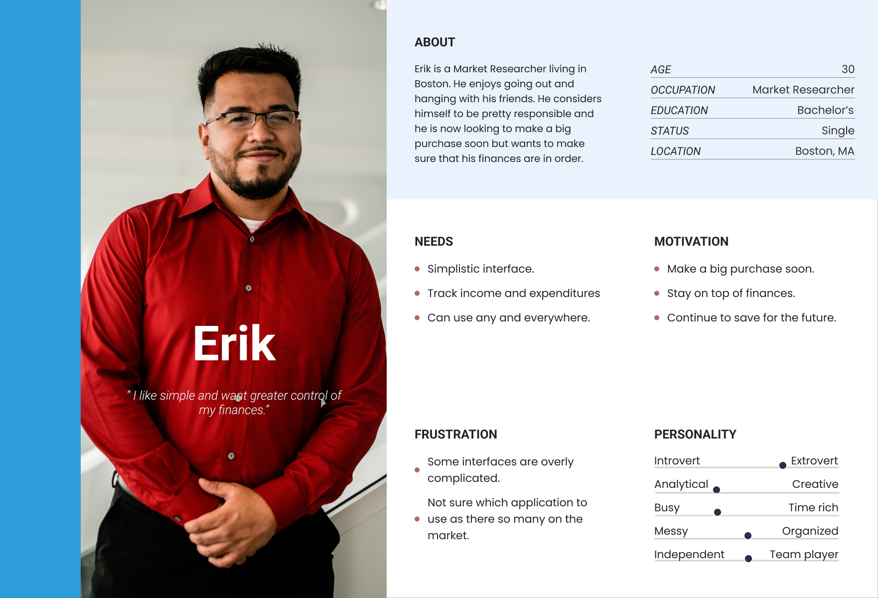
THE PERSONA
A persona was created to further address concerns, wants and needs. Information from research will help in the design process. Let’s learn a bit more about Erik:
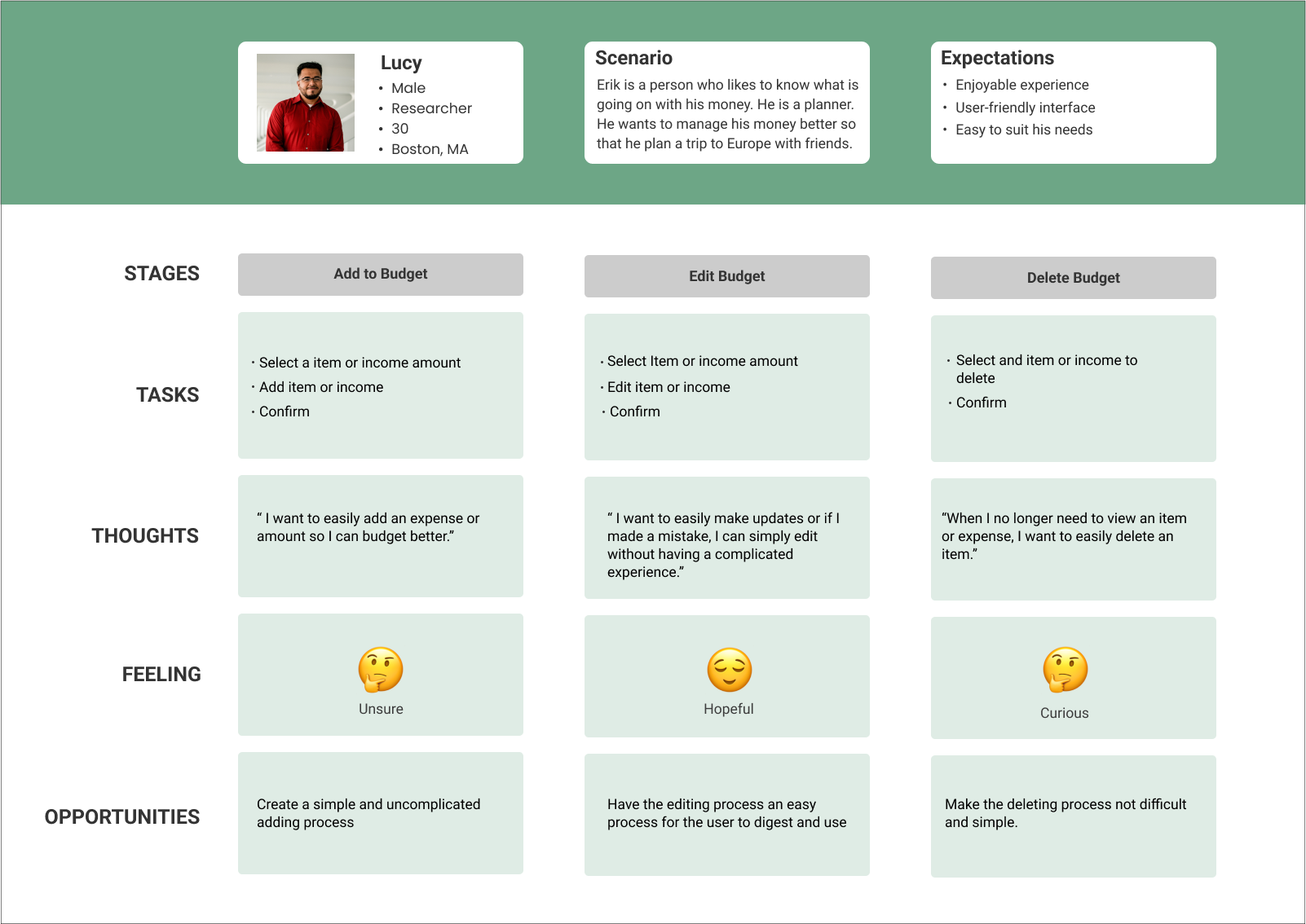
USER JOURNEY MAP
To make the experience more pleasant for future users, data was collected to measure and alter key points.
PROPOSED SOLUTIONS
Create a simple interface that is not complicated and doesn’t have a lot of bells and whistles.
Easy to understand and able to create categories that seem fit to the users needs where they can easily locate.
IDEATE
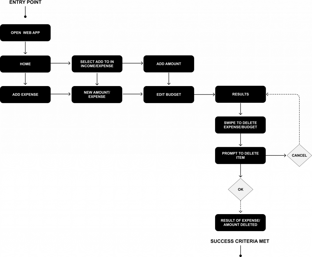
USER TASK FLOW
I created a task flow to illustrate how the user will accomplish a task, from signing in to adding a viewing spending, and how they will interact with the product.
“As a budget user, I want to add, edit, delete expenses and budgets so that I can have better control on my everyday expenditures.”
User Flow: Updating Budgets and Expenses
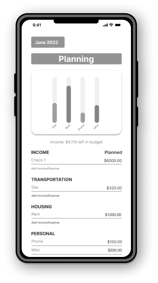
WIREFRAMES (LO & MID FIDELITY)
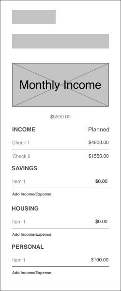
Both low and mid-fidelity wireframes of viewing spending and checks were created to show the layout of the application. The interface elements were continuously improved through a continuous iteration process.
*LOW FIDELITY
The first step in my design process is creating low-fidelity wireframes ensuring and getting a clear understanding of the functionalities and designs to support.
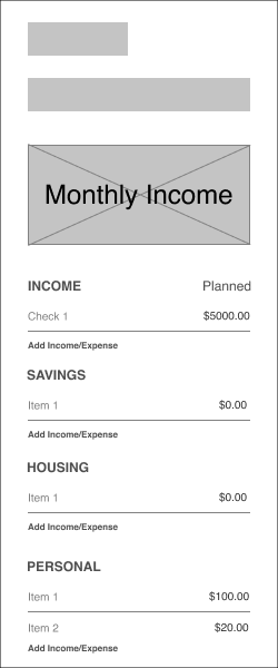
Updating Budgets and Expenses
USABILITY TEST & RESULTS #1
The usability test’s goal is to uncover flaws and things that are not straightforward in the designs. Participants were asked to perform a series of tasks while observing them and making notes.
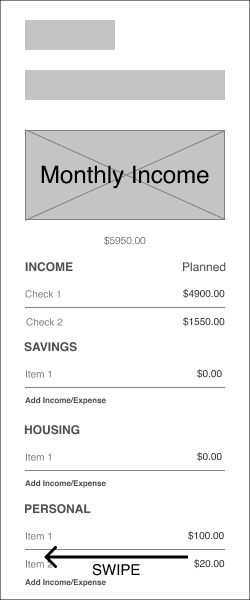
PAIN POINT
Originally, participants were asked to delete an expense and they didn’t know to swipe left.
SOLUTION
Instead of swiping left and delete button that a user can swipe will be used.
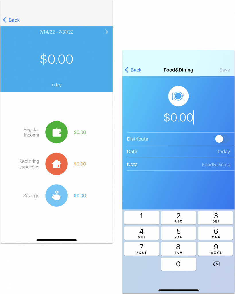
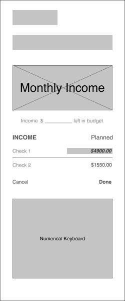
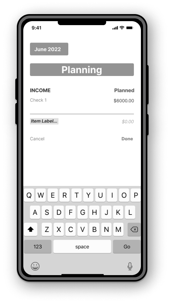
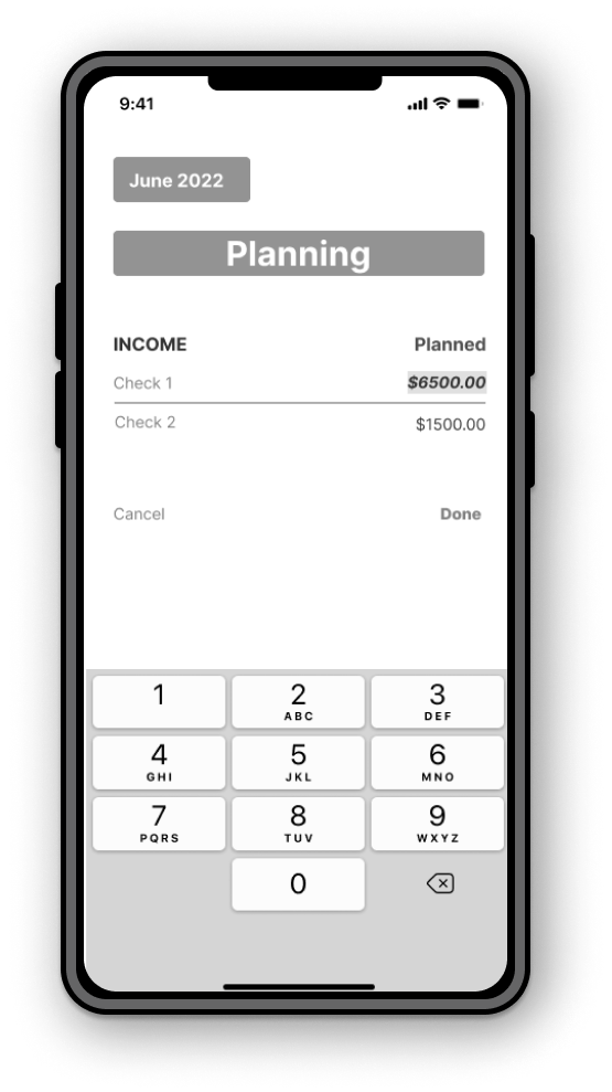
*MID FIDELITY
Using information from the first Usability Test, more copy and details are applied to application.
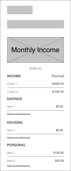
Add to Budget
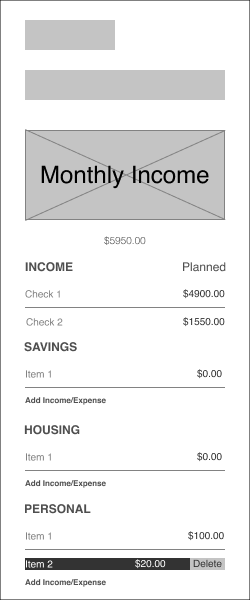
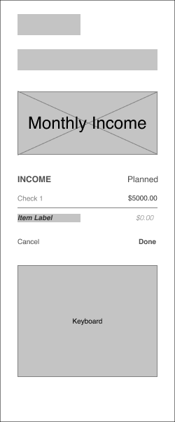
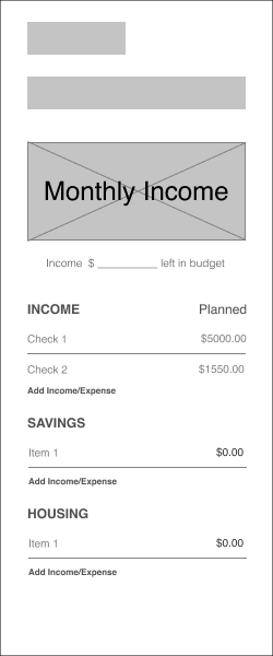
Adding Income and Expenses
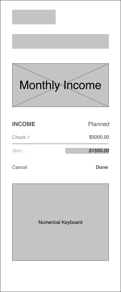
Edit Budget
Editing Income and Expenses
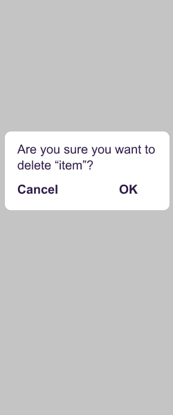
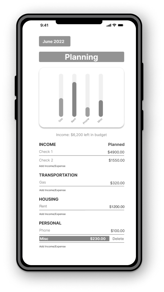
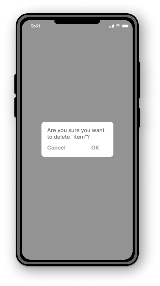
Delete Budget
Deleting Income and Expenses
USABILITY TEST & RESULTS #2
Creating another iteration, we asked participants to complete a set tasks to see what further improvements need to be made on the redesign.
PAIN POINT
Reduce some of the steps to delete an item. Too many steps.
SOLUTION
Reduced the amount to steps to delete an item.
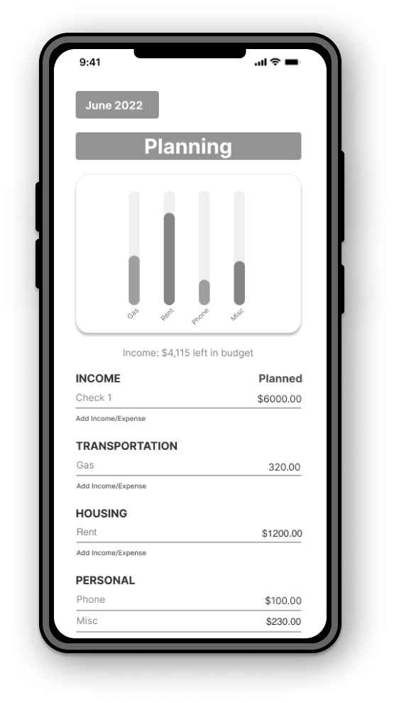
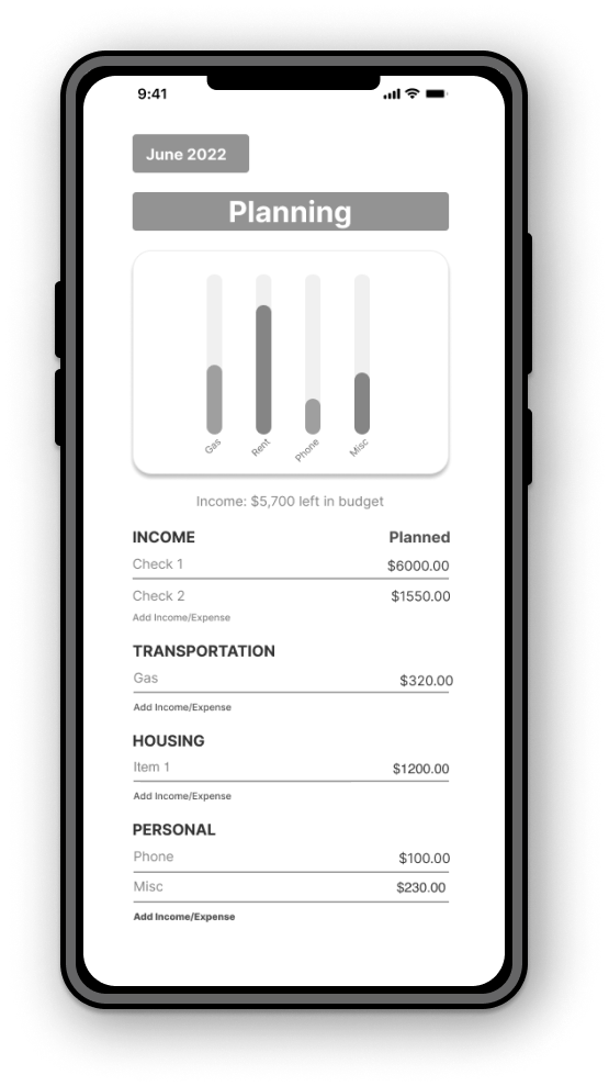
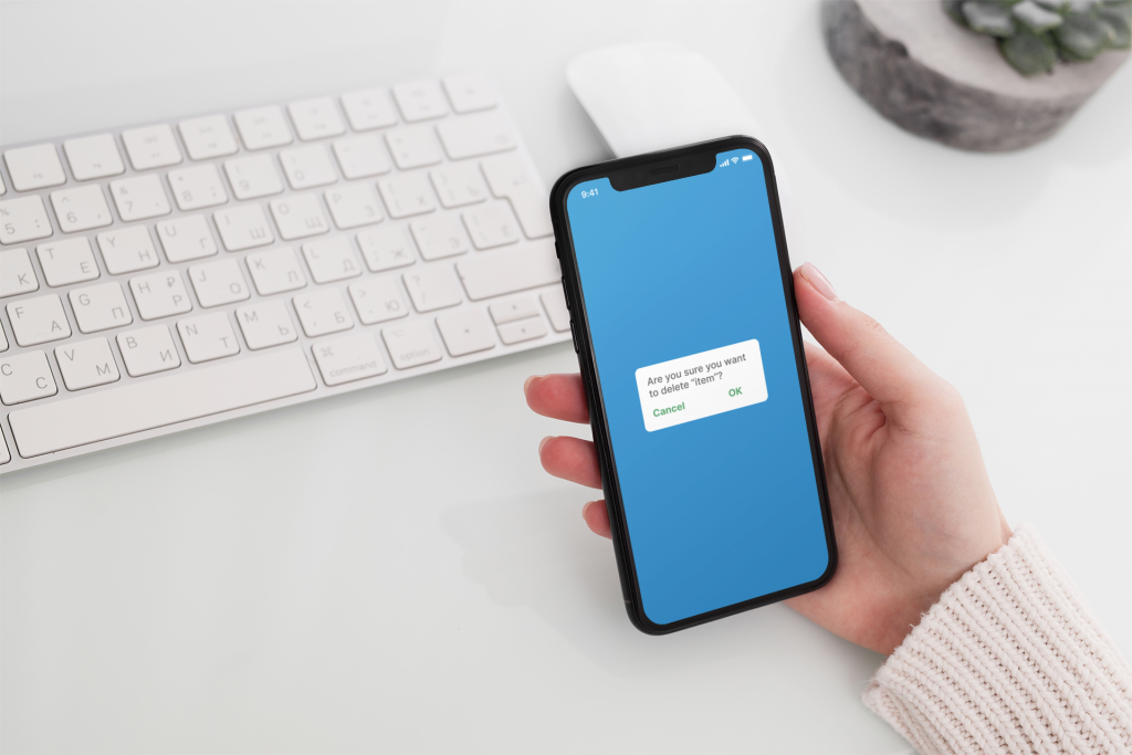
PROTOTYPE
HI FIDELITY PROTOTYPE
After receiving feedback from the usability testing as well as getting inspiration from a mood board, I was able to create the look and feel and add the subtleties of the redesign.
USABILITY TESTS & RESULTS #3
PAIN POINT
Participants noted to darken the green on the CTAs as the light green made the application difficult read.
SOLUTION
The decision was a simple one and that was to darken the CTAs throughout the application to make it more readable to the user.
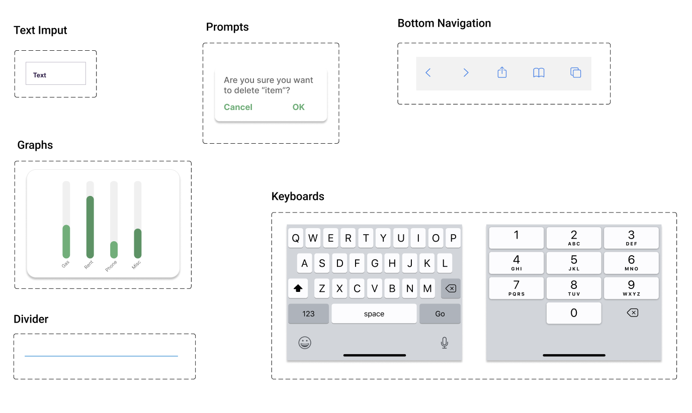
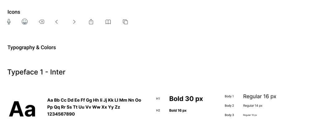
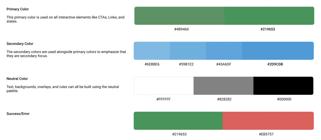
DESIGN SYSTEM
For this student project, a design system was created as there was not a design system to refer to.
retrospective
WHAT WAS LEARNED
I learned to allow additional time to work around people’s schedules and patience is key. Have a plan. Save everything and more than often, sometimes simpler is better.
The goal of this app is to create a platform where users (such as the persona, Erik) can easily access the application feature to better budget his expenses as he soon wants to make a big purchase. I believe the goal of this project is met.
WHAT NEXT
Continue to implement MVPs throughout the application to bring more value to the users using this application and make their experiences enjoyable.