Let’s face it, dogs are cute but training them is hard! Often-times, dog training can be an overwhelming and frustrating process with many not knowing where to start or even whom to speak to in a manner that is convenient!
Goals
Have users refer to our content and work with our experts to train their beloved fur babies.
Solution
Create a simple and user-friendly app that has users feeling less frustration and overwhelmed with dog training.
Tools
Figma I Zoom I Miro I User Testing I Optimal Workshop
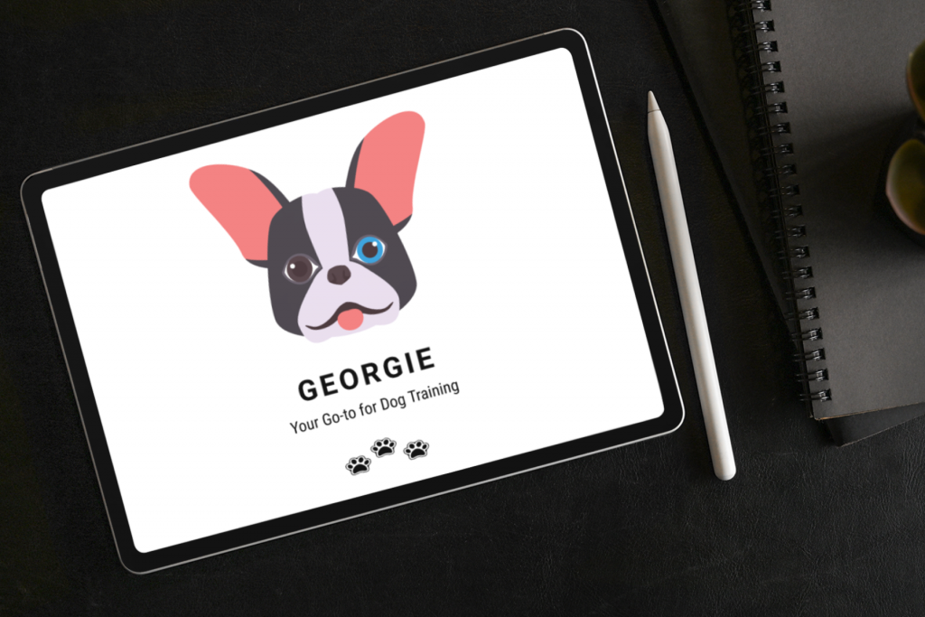
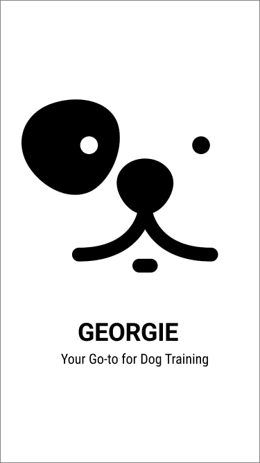
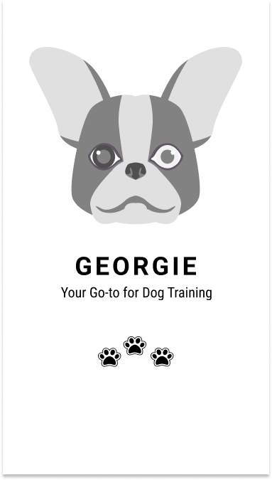
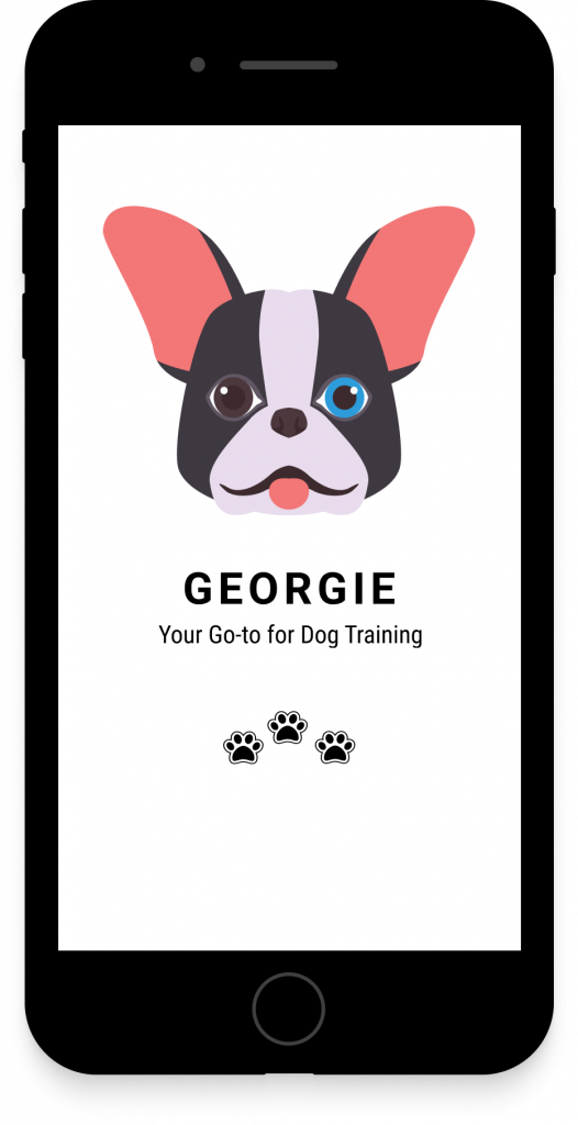
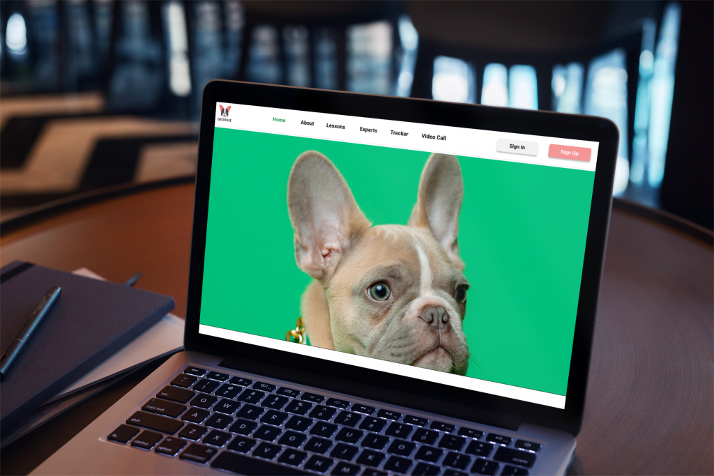
What is Georgie?
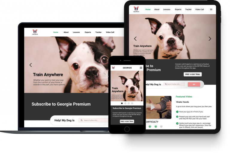
GEORGIE is a dog training responsive web app that helps new and seasoned dog owners, who are seeking accessible and easy ways to search for content and speak with an expert in real-time, address their concerns from the comforts of their homes.
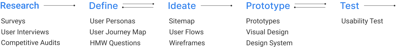
My Design Process
RESEARCH
To solve these issues, we needed to get a better understanding of the pain points that dog owners have with dog training.
Participants vary in socioeconomic status, gender, experience, and location.
Questions:
What methods do dog owners use to gain/learn content?
How much time can they dedicate to training methods?
What is the level of interest in working with an expert?
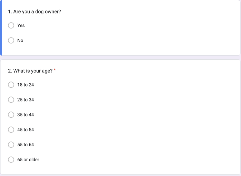
Surveys
QUANTITATIVE/INDIRECT
To answer these questions, we gathered information on what users are doing, feeling, and thinking by using sources such as Reddit, Email, and Word of Mouth.
PARTICIPANTS
10
AGED 25-34
23.0%
ACTIVE
72hrs
DOGS AGED 6-8
29.0%
AGED 45-54
29.0%
PRIOR TRAINING
70%
AGED 35-44
17.0%
TRAIN DOGS 15-30 MIN
70%
Interviews
QUALITATIVE/DIRECT
PARTICIPANTS
0
MALES
2
MIAMI, FL
50%
FEMALES
2
NEW YORK CITY
55%
AVERAGE AGE
33
Paul, 38 | Banker | Lives in Miami, FL
“I frequent YouTube for tips on training
commands and tricks and I read online blogs as well as books”
Yuri, 28 | Pilates Instructor | Lives in New York City
"Learning at home would be great because it’s great for people who are short on time and don’t necessarily feel like going to group classes or training facility."
Stacy, 31 | Analyst | Lives in New York City
"I got my dog without doing my homework. When it comes to dog training, I do
not even know where to start. I need help."
Discovered
USERS WANTS
Friendly user interface
A simpler way to retain information
Can learn from anywhere
THEIR MOTIVATIONS
Better trained dog
The need to take care of responsibilities
Hypothesis
Based on the information gathered from the interviews, we believe that by developing an app that is easy to navigate, allow users to use the app anywhere, and retain information, we would be able to meet the user goals.
We will know this is true when we see content accessed and sessions scheduled that users leave positive reviews and recommend our app to other users.
Competitive Audits
METHOD: SWOT MATRIX
What platforms exists already? How can we turn what’s missing from these platforms into our user’s goal? PUPPUR | DOGO
PUPPUR
DOGO
Overview
Overview
Puppr includes step-by-step video and photo instructions for lessons that range from basics like potty training to advanced tricks such as handstands to hooped arms. All lessons are taught with positive reinforcement.
Provides users with 70+ lessons, video instruction, live chat with dog trainers, photo galleries, a built-in clicker, and users can keep track of their progress.
Basic-level tricks are available entirely for free. Puppr includes premium lesson packs that each come with 2 free lessons and additional locked content that can be purchased. Puppr Premium (live chat with Sara and her fellow Dog Trainers) is either $12.99 per month or $99.99 per year after a 7-day free trial.
Puppr has positioned itself highly not only in the App Store with a rating of 4.8 out of 13k overall reviews but also has received an Editor’s Choice award with Google Play with a rating of 4.5 in the Google Play Store with its easy-to-use interface and step-by-step instruction.
Similar apps such as Dogo, GoodPup, as well as Pupford offer similar services.
Google as well as Blogs are free sources to use for learning how to train dogs.
Overview
Overview
Dogo is the one-stop app (dog clicker included) for dog lovers to train their pup basic to advanced tricks and more and meet like-minded people using game elements and positive reinforcement to make training fun, digital, and personalized.
Dogo provides users with 100+ Commands, Games, Potty Training, Personal Feedback from Trainers, Articles, Video Exams, Photo Challenges, and Dog Training with a built-in Clicker for responsible dog parents.
Answer a list of questions and Dogo matches your results to a particular training program. Freemium app with an option to upgrade (live chats with Dog Trainers). Dogo Premium plan (subscription): 1 month $9.99, 3 months $26.99 and 1 year $99.99.
Dogo has positioned itself highly not only in the App Store with a rating of 4.8 out of 7k overall reviews but also has a rating of 4.7 on Google Play. Frequent App of the Day on Apple, thanks to localization and Dogo is the first dog training app offering personal feedback through video exams.
Similar apps such as Dogo, GoodPup, as well as Pupford offer similar services.
Google as well as Blogs are free sources to use for learning how to train dogs.
We conducted a competitive analysis to see what our competitors in the market are doing. We wanted to compare the value and customer satisfaction delivered by our competitor’s products, prices, and channels with our current situation.
DEFINE
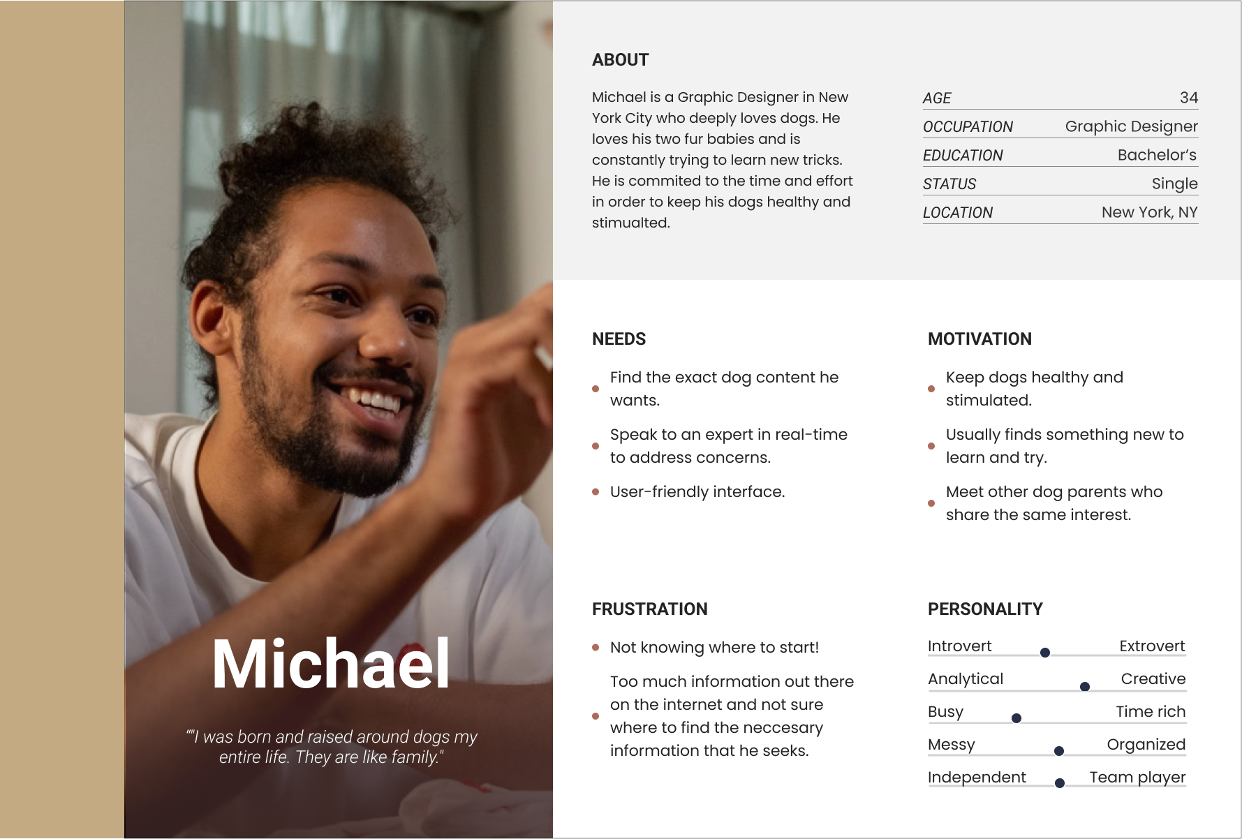
The Persona
Synthesizing the research into a set of deliverables, this will help me in keeping the users as a priority in the design process. From this information, a persona was created to represent users and illustrate key user needs and expectations.
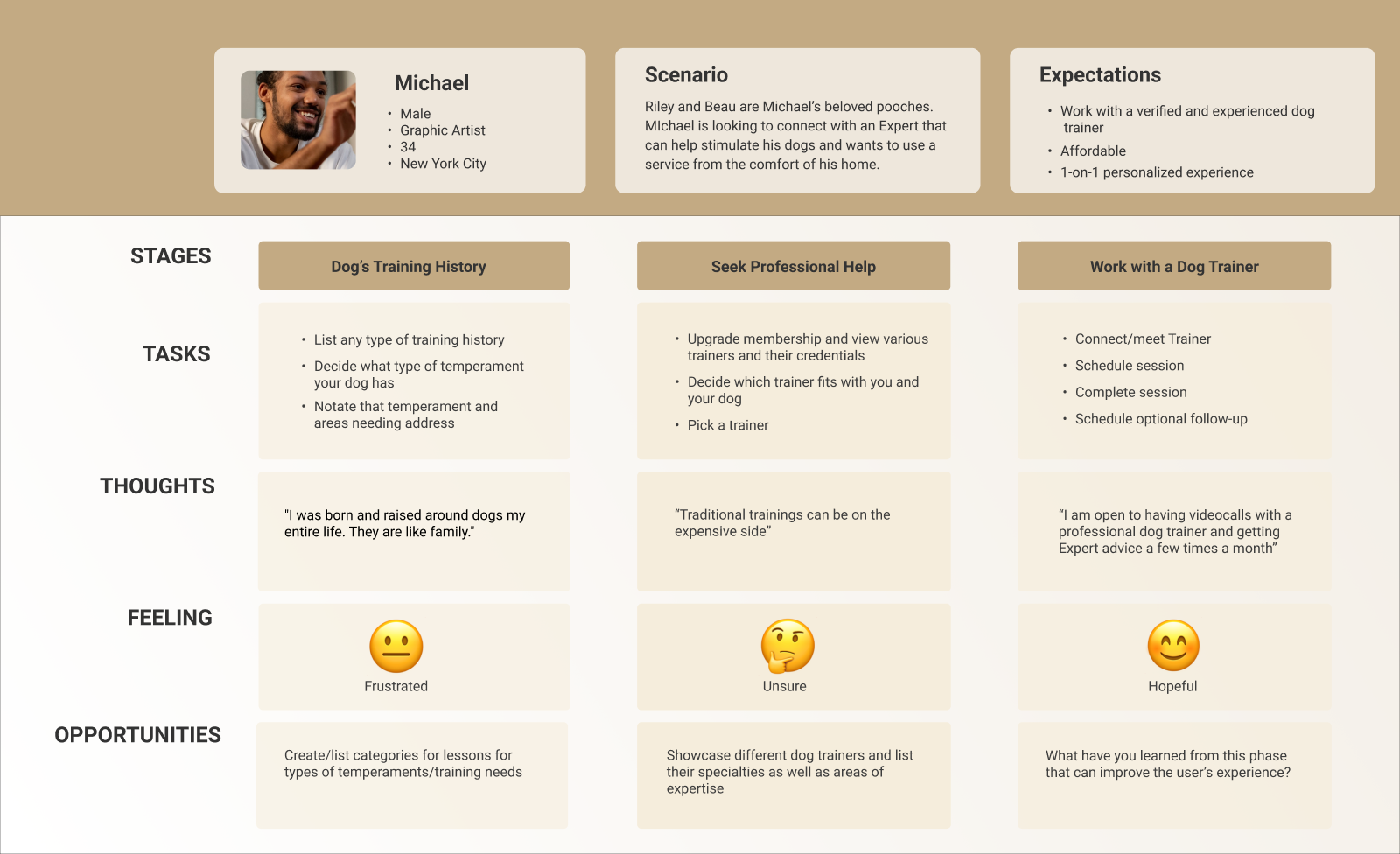
User Journey Map
User Journeys are an awesome tool to understand the experience the product currently provides to its users. We have mapped out the current user journey and identified the pain points and challenges we wanted to improve.
Potential Solutions
CONNECT | TOOLS | TRAIN
Connect with a Trainer in real-time from the comfort of your home to address any concerns you may have
The use of tools such as Clicker to help with the training process and to alleviate the need for extra items.
Create simple step-by-step short video tutorials for users to to teach their pups tricks or address any behavioral concerns they may have.
IDEATE
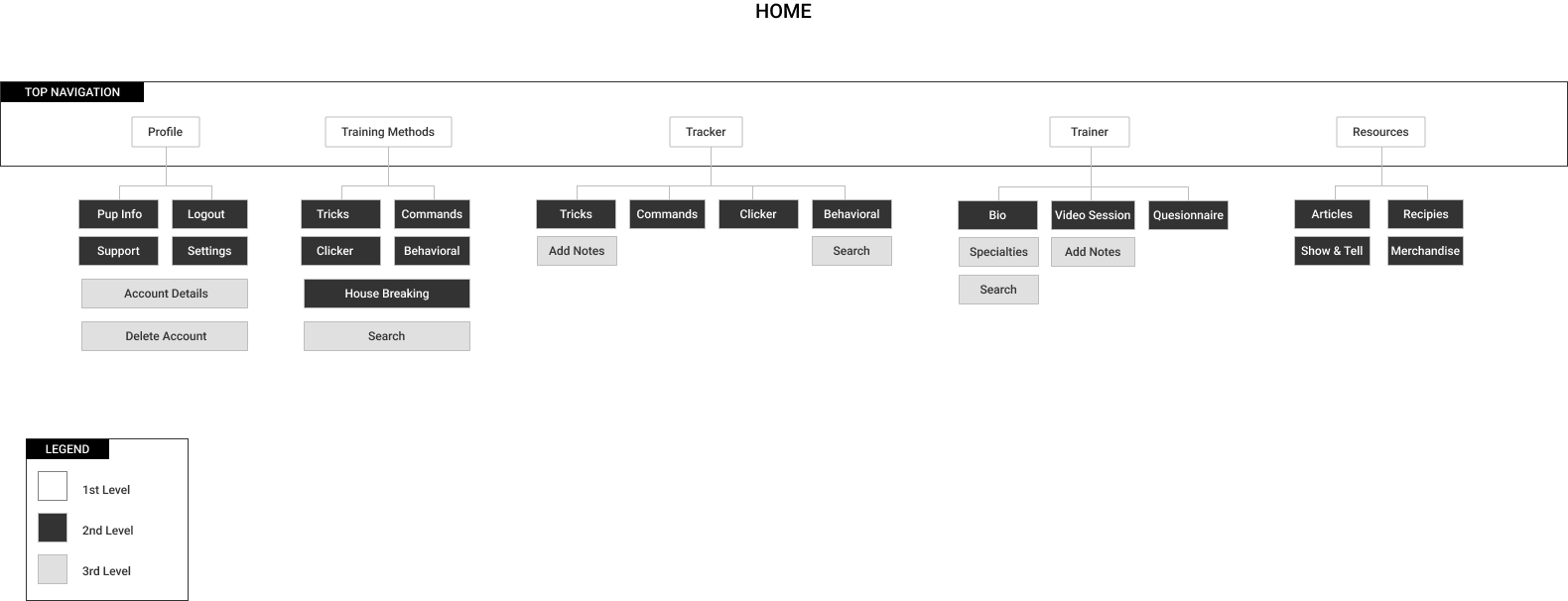
Feature Prioritization (Sitemap)
We conducted more interviews (Open and Closed Card Sort activity). Based on user needs, we were able to pinpoint specific features we want to add to this app.
OPEN CARD SORTING RESULT:
We provided with menu items and provided users with 2 categories: Top level menu & Secondary level menu.
Users identified Profile, Training Methods, Tracker, Trainer, Clicker and Resources.
5
20%
20%
60%
Participants
Located in Miami, FL
Located in Ambroy, IL
Located in New York
9
10
20
5:21
Preset Categories
Non-Preset Categories
Total Categories/Cards
Avg Time to Complete Task
CLOSED CARD SORTING RESULT:
We provided menu items with no categories.
Users split menu items into those categories and the grouping of items in terms of top level menu to secondary.
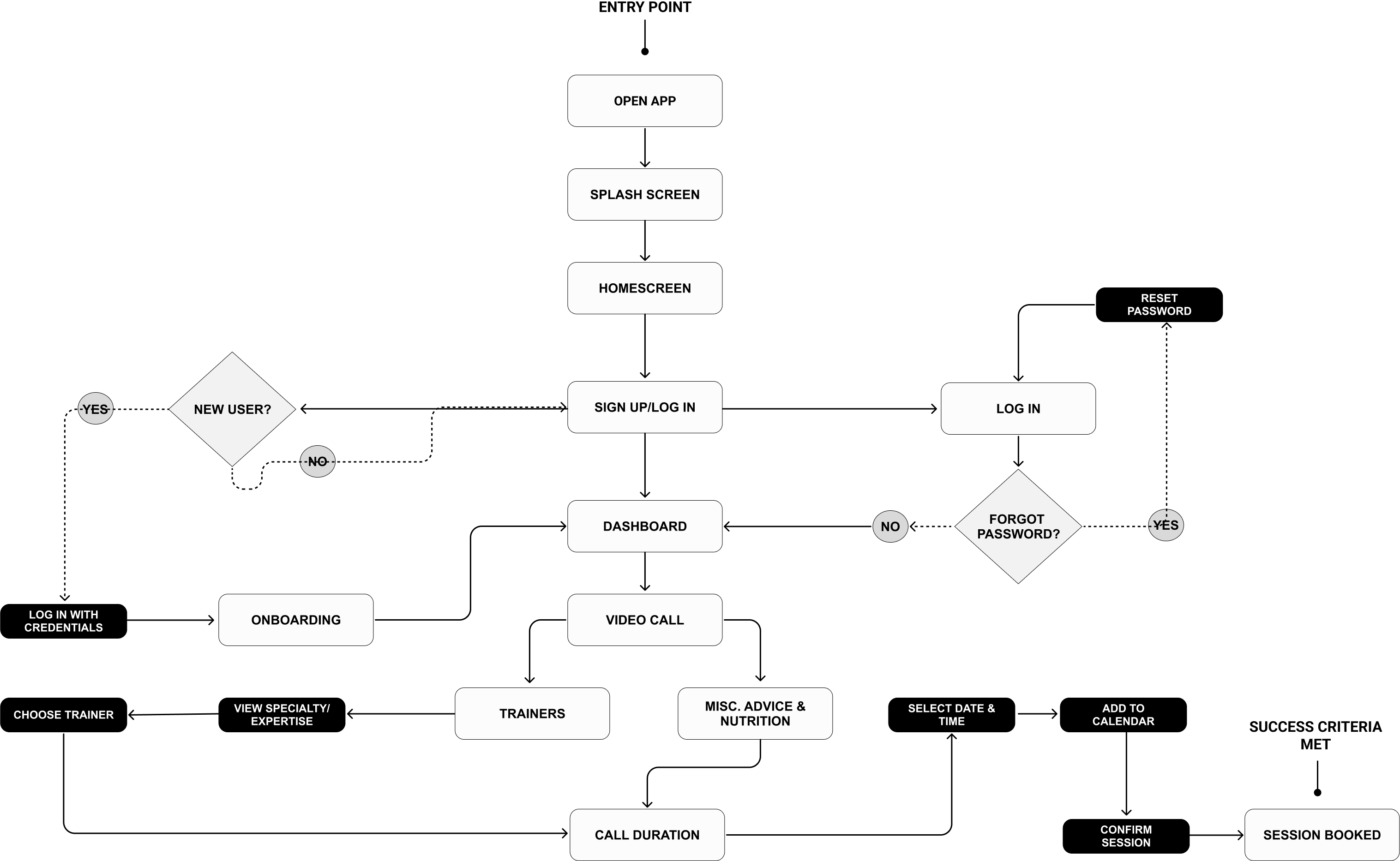
I created a task flow to illustrate how the user will accomplish a task, from opening an app to adding a request, and how they will interact with the product.
“As a dog owner, I want to be able to book a video call with an experienced and verified dog trainer so that I can reach my goals training my dog.”
BOOK VIDEO SESSION
Wireframes (Low & Mid Fidelity)
To demonstrate the App’s content and layout, I created both low and mid-fidelity wireframes of booking a session. The navigation system and interface elements were continuously improved through a continuous iteration process.
*LOW FIDELITY
The first step in my design process is creating low-fidelity wireframes ensuring and getting a clear understanding of the functionalities and designs to support.
BOOKING A SESSION
Usability Tests & Results #1
Participants were asked to perform a series of tasks while observing them and making notes. The usability test’s goal is to uncover flaws and things that are not straightforward in the designs. Using the test findings, we can iterate the designs and create a much better, smoother user experience.
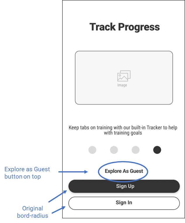
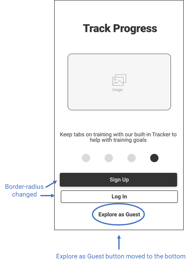
PAIN POINT
Participants noted that they were not used to Explore as a Guest as the top button option.
SOLUTION
Move the Explore as Guest below the Sign up and Log in buttons to create a better flow.
*MID FIDELITY
More copy and details are added.
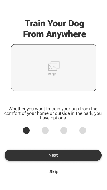
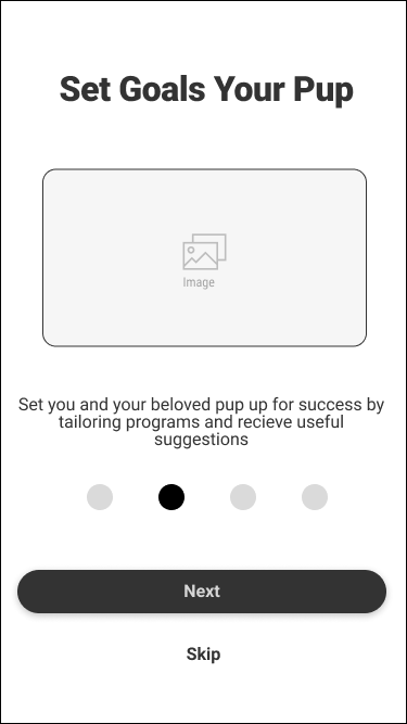
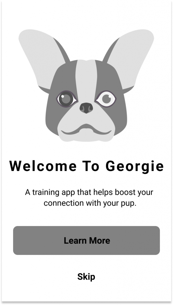
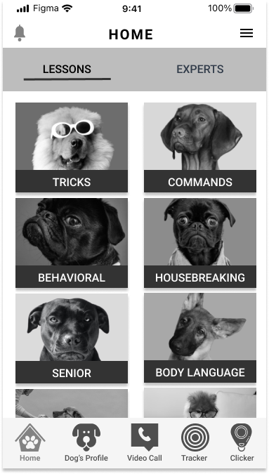
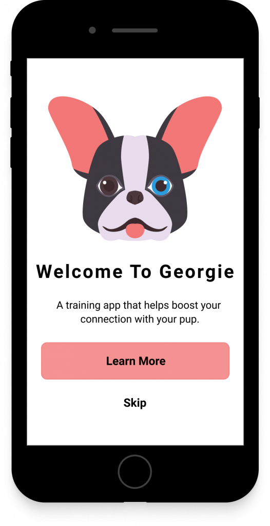
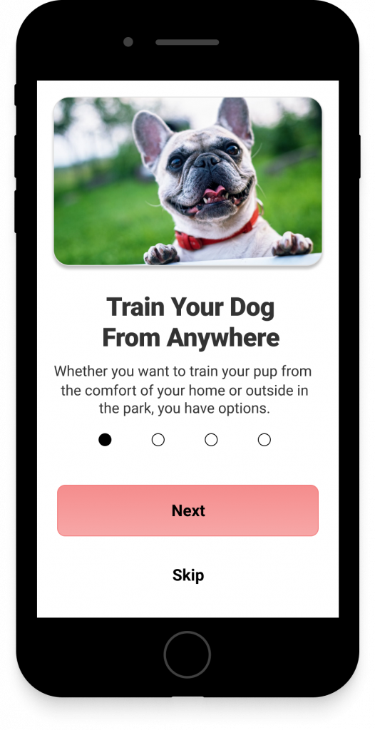
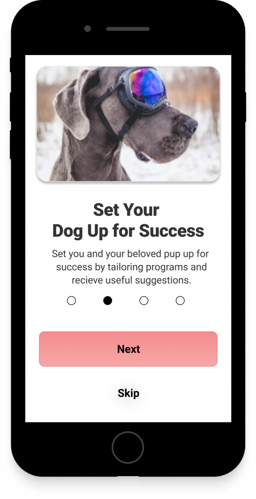
Intro Screen and Onboarding
The app’s onboarding section tells users what the app is all about when they open it for the first time.
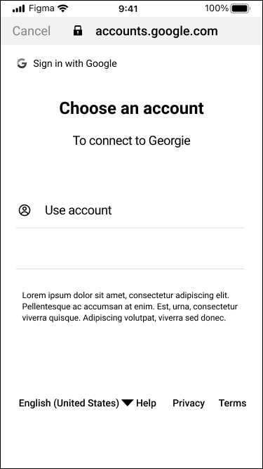
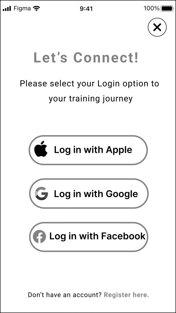
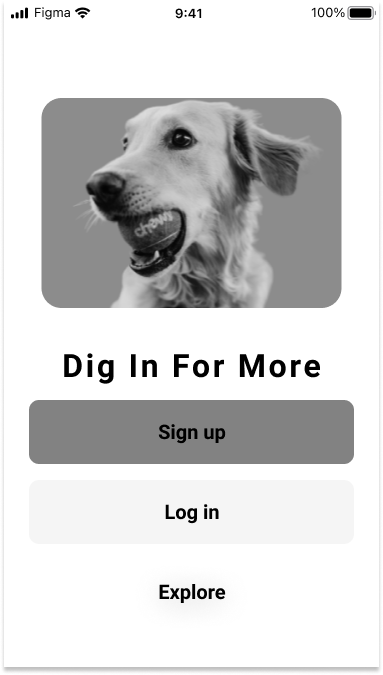
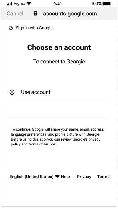
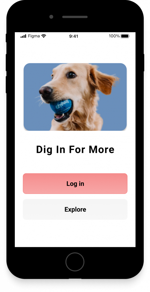
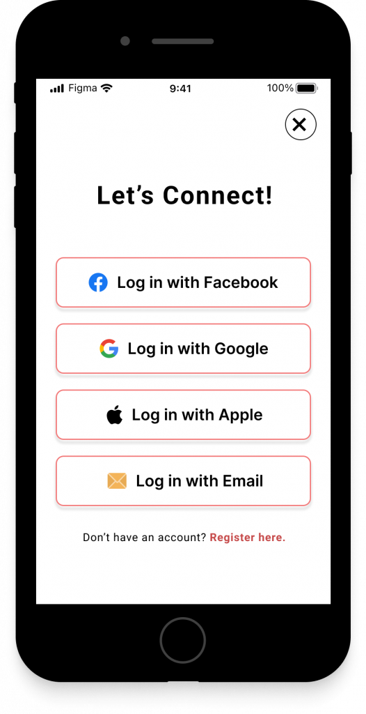
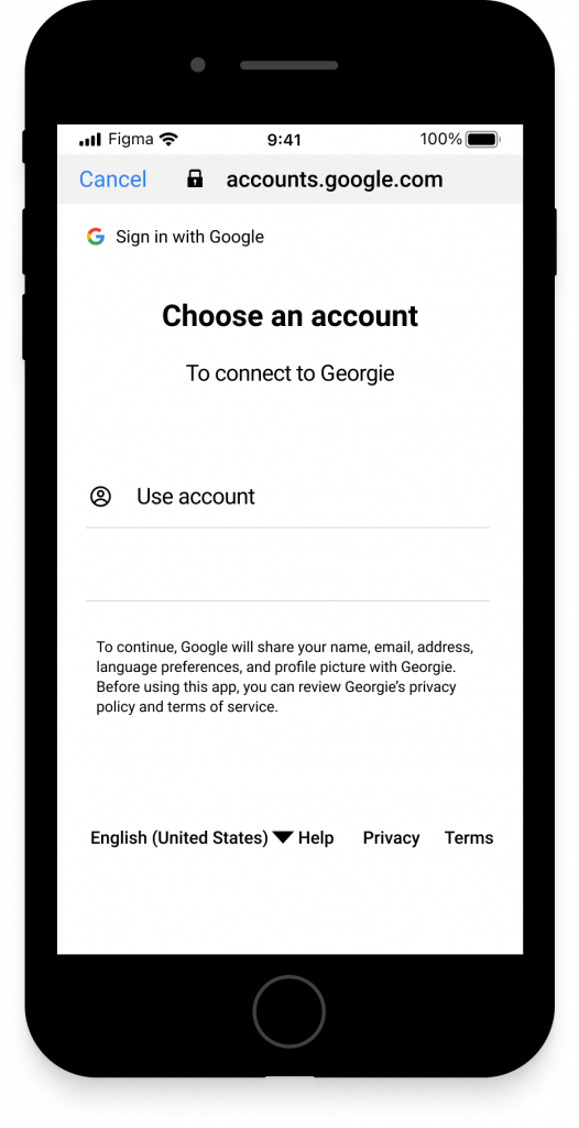
Login
Users have various options to sign in to their account or just explore the app as a guest.
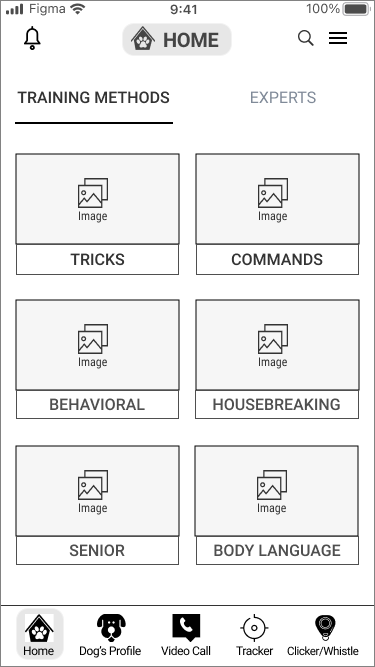
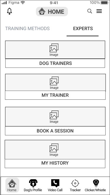
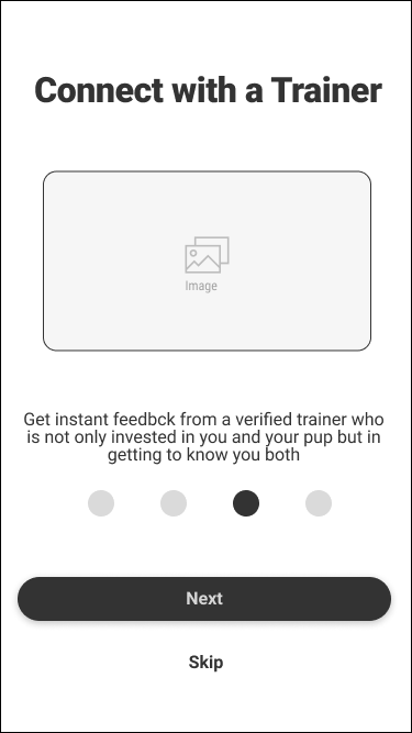
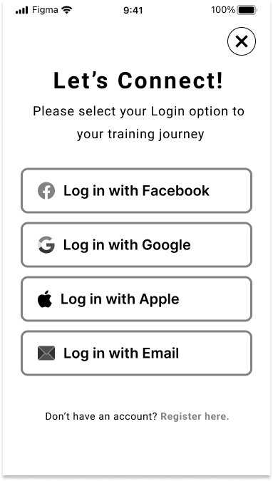
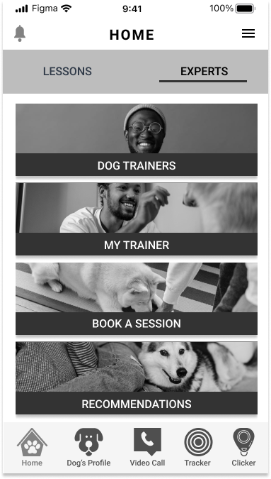
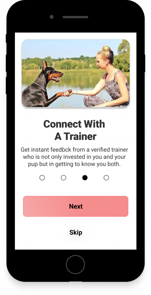
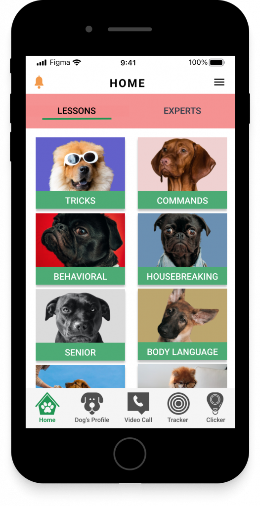
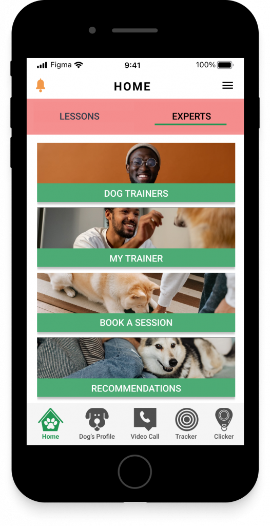
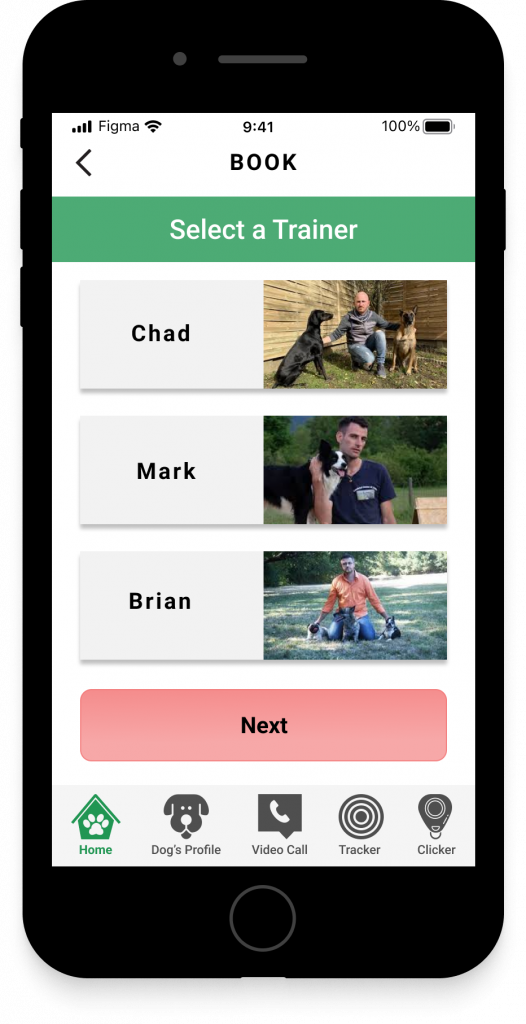
Select/Connect with an Expert
The user can sign up to speak with or work with a dog expert to address their concerns.
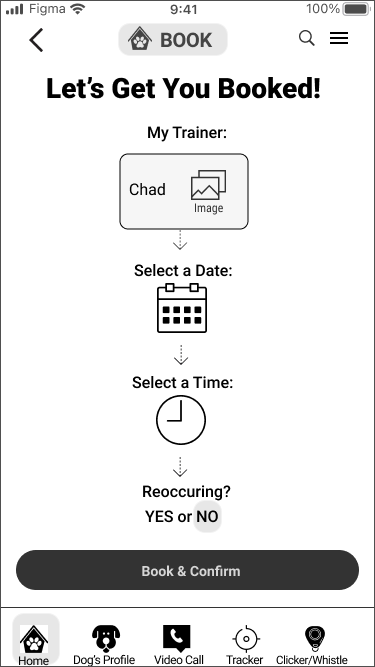
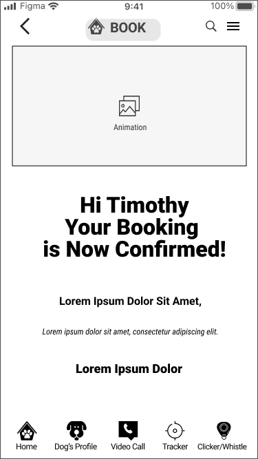
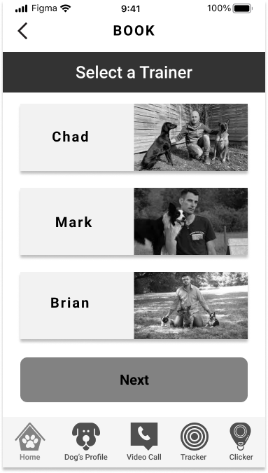
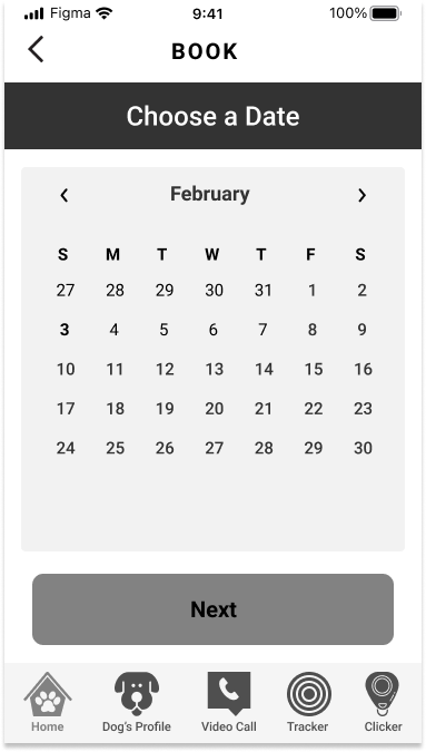
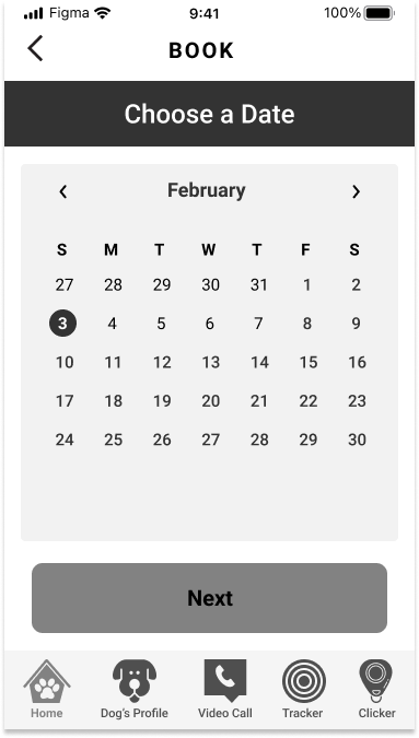
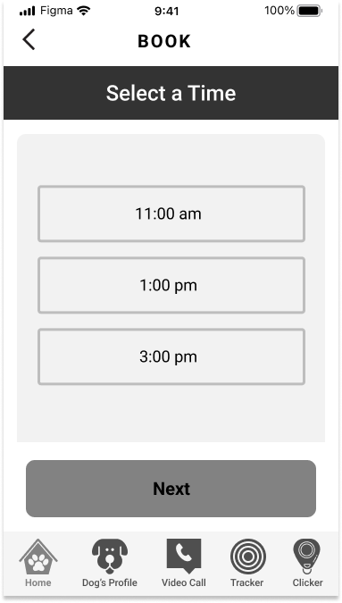
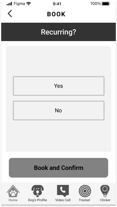
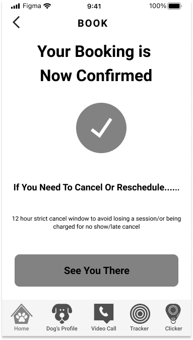
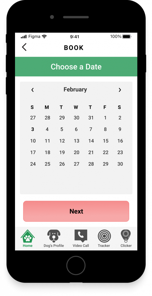
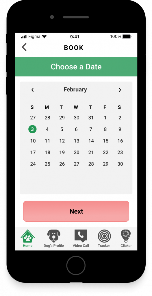
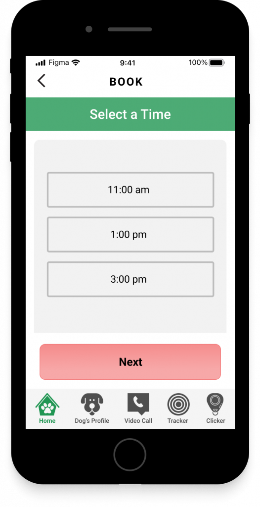
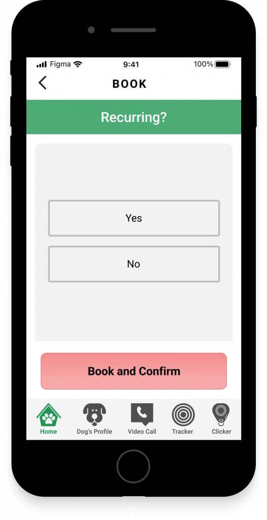
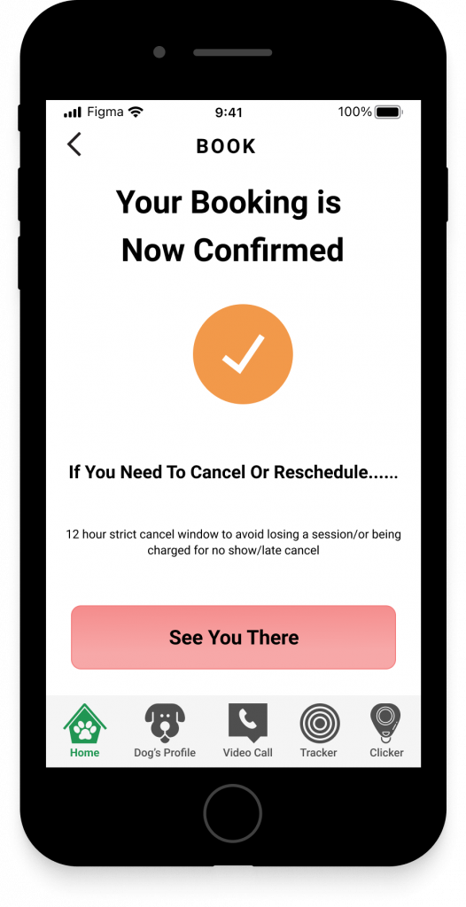
Schedule and Confirm a Session with an Expert
The user will select and day and time to schedule with an Expert and confirm the session.
Usability Tests & Results #2
Having a more detailed app, we asked participants to complete a set tasks to see what further improvements need to be made on the app.
PAIN POINT
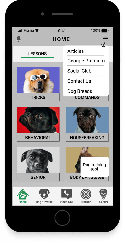
Upon entering the Home Screen, users would like to have an idea as to what tools/functions are.
SOLUTION
Create an overlay for users before they enter the Home Screen to give them a guide as to what functions/tools are.
PROTOTYPE
Hi Fidelity Prototype
My first step after creating the wireframes is to create the so-called Look and Feel designs. Designing a product explores different visual concepts to determine the best direction to take.
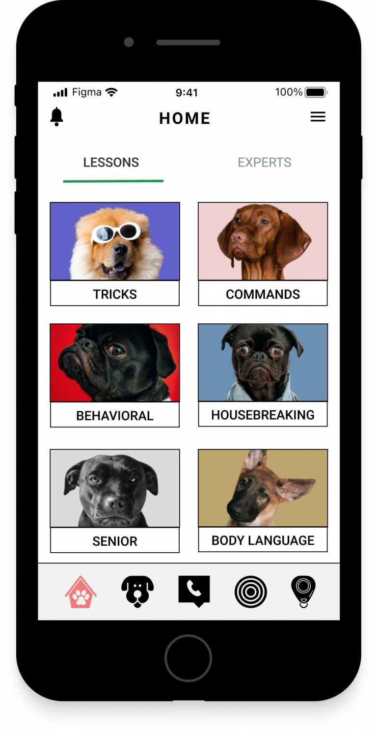
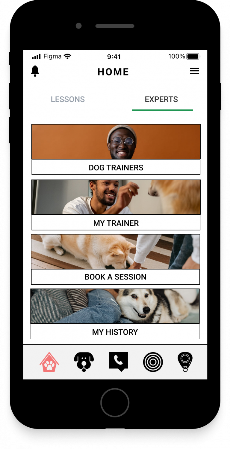
Intro Screen and Onboarding
The app’s onboarding section tells users what the app is all about when they open it for the first time.
Login
Users have various options to sign in to their account or just explore the app as a guest.
Select/Connect with an Expert
The user can sign up to speak with or work with a dog expert to address their concerns.
Schedule and Confirm a Session with an Expert
The user will select and day and time to schedule with an Expert and confirm the session.
Usability Tests & Results #3
PAIN POINT
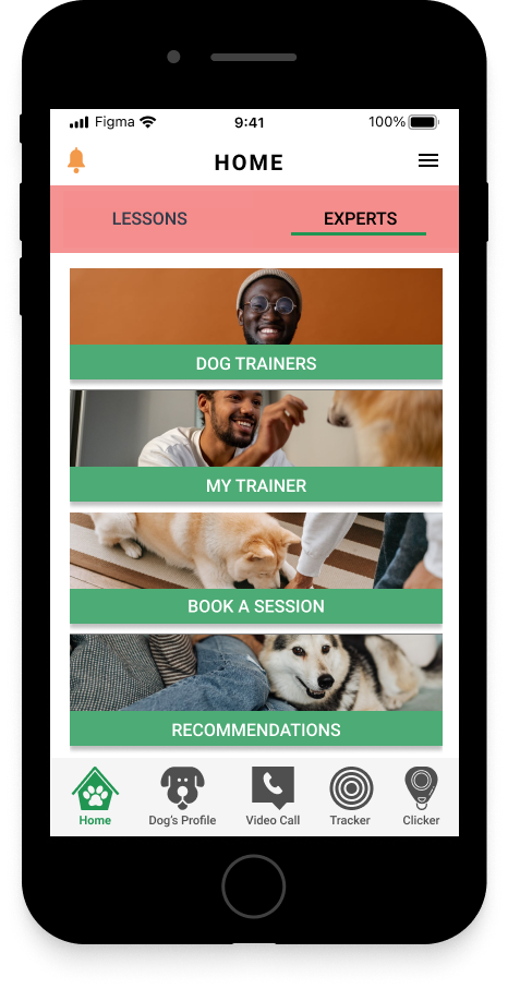
Participants noted the lack of color considering that this is a light and fun application. Also, was noted how the pink was a bit harsh on the eyes.
SOLUTION
Added the green color to contrast against the white and pink colors so that the screens will come across as more readable.
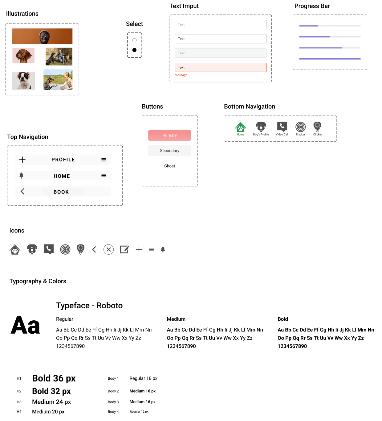
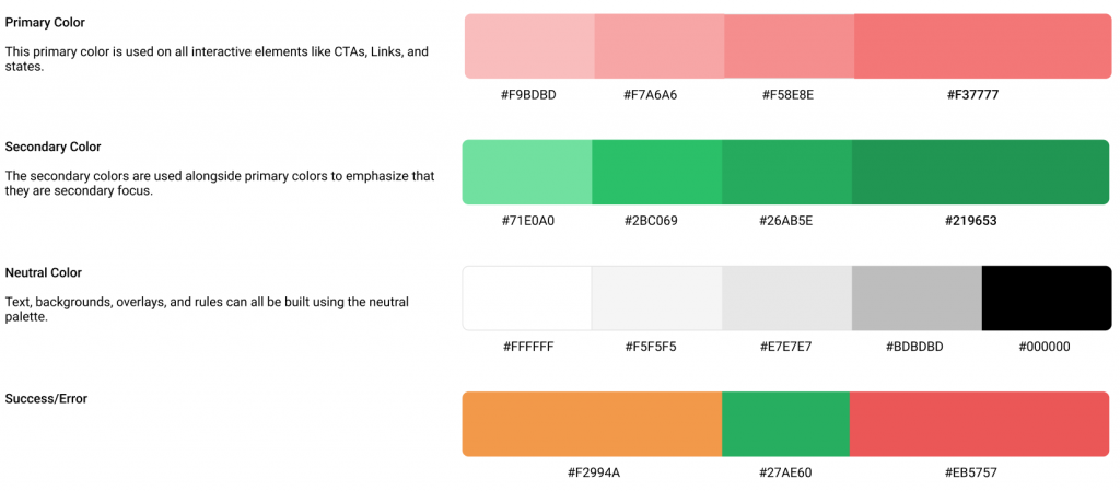
DESIGN SYSTEM
For this student project, a design system was created as there was not a design system to refer to.
TESTS
USABILITY TESTS
Usability tests are vital when building digital products. During a test, participants are asked to perform a series of tasks while observing them and making notes. The usability test’s goal is to uncover flaws and things that are not straightforward in the designs. Using the test findings, we can iterate the designs and create a much better, smoother user experience.
PAIN POINT
Upon entering the Home Screen, users would like to have an idea as to what tools/functions are.
SOLUTION
Create an overlay for users before they enter the Home Screen to give them a guide as to what functions/tools are.
Georgie Prototype (Full)
Clickable prototype using Figma.
retrospective
Impact & Outcome
The product helped dog owners save time and ease frustrations with dog training. By using this application, users were able to get their concerns address in a timely matter by referring to the content or reaching out and connecting with a dog expert. Users have confidence when it comes to all things dog related.
CUSTOMERS
Convenience speaking to an Expert in a timely manner.
Enjoyed the simplicity of the app.
BUSINESS
Adoption and Engagement went up 20%
Customer Satisfaction up +33% “I can definitely see myself using this app.” – Stacy
What Was Learned
During the design phase, I struggled with the simplicity of the design, it seems to me like it’s too plain and boring. During the user testing phase, I found out that users actually like the simplicity, flow, and how straightforward the app is. Less is more! I’ve learned that design is driven by data and good communication is key for a designer-developer collaboration.
The goal of this app is to create a platform where users (such as the persona, Michael) can easily access content and connect with a dog expert in real-time to help stimulate both his beloved fur babies Beau and Riley. By turning Michael’s frustrations into excitement to want to use GEORGIE, I believe the goal of this project is met.
Accomplishments
By using the Jacob Neilsen’s heuristics, I was able to increase the flexibility and efficiency of use for the user while creating a simple aesthetic and minimalist design.
What Next
Having a more extensive dog breed list will add value to the app. The next step is to build some sort of integration, redesign user flow and iterate on wireframes.