Redesign the interface of the web app – log in and features for users who want an enjoyable online banking experience using the application to complete tasks and fulfill their needs.
Goals
Create a platform where users can easily access their accounts and view spending habits in a way that is not complicated.
Results
Users feel a sense of ease using this app and also feel as though that their information is secure.
What is Truist?
Truist is a financial institution and merger of the two biggest banks in America, BB&T and SunTrust. The name represents the two companies with the motto of “to serve our clients as a true financial partner.”
Tools
Figma I User Testing I Optimal Workshop
My Design Process
ANALYZE
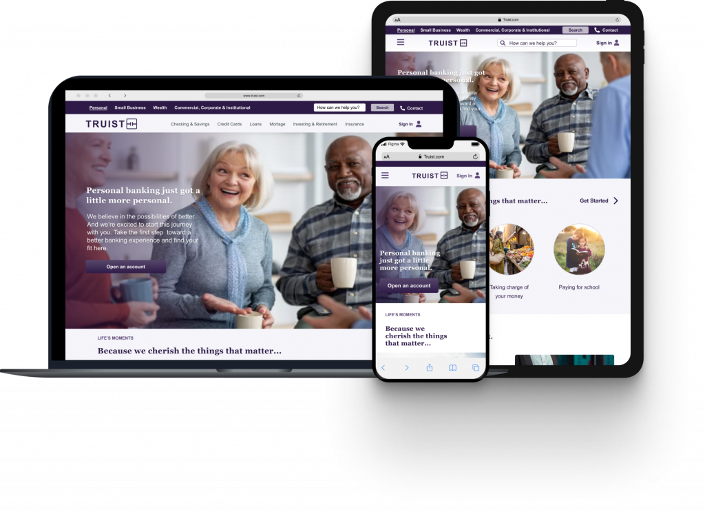
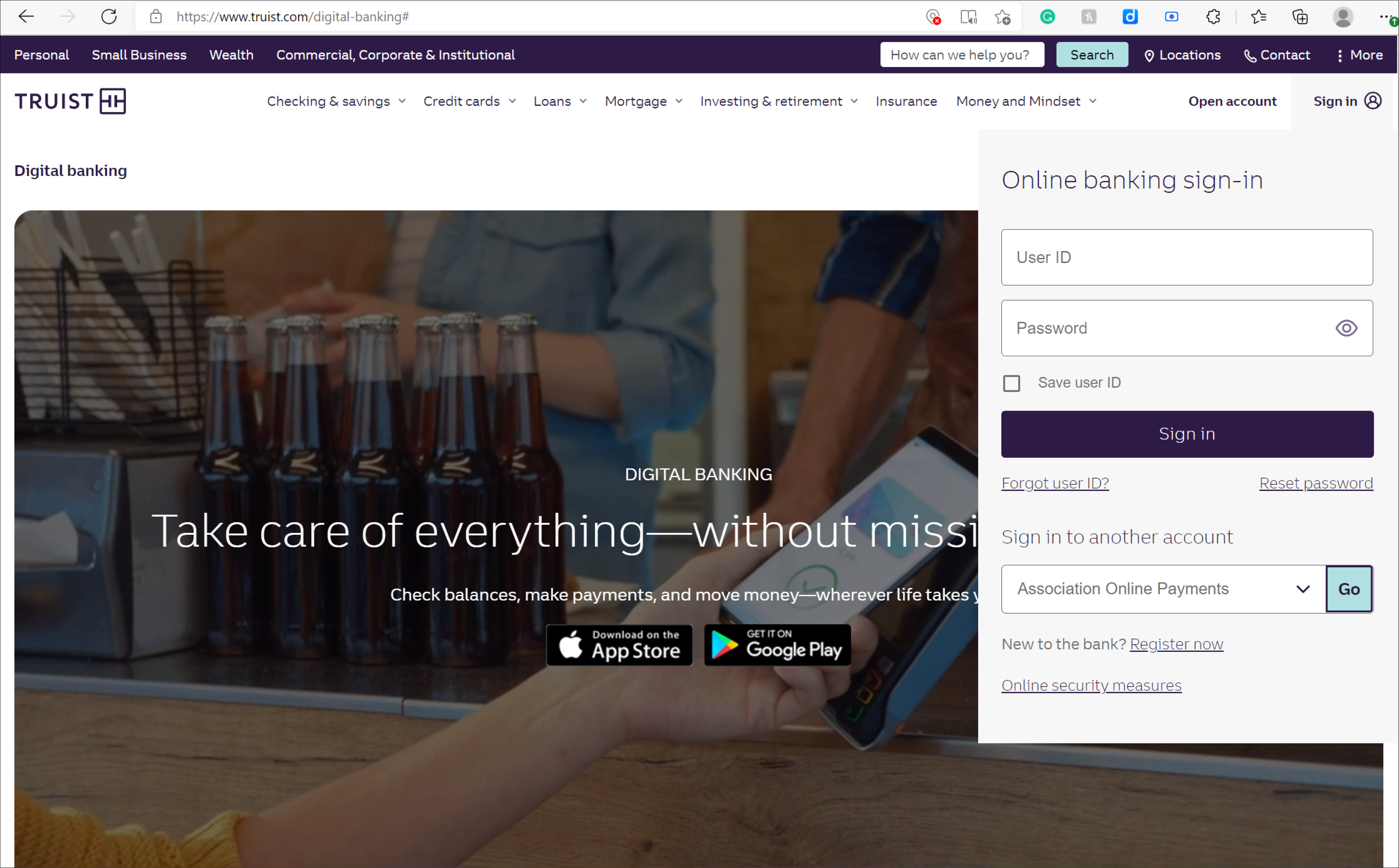
The first step in my process is to get screenshots and/or information about the existing log in and interface design as well as branding. The existing branding of Truist is dark and I wanted to enlighten the web app to reach a wider range of audiences, especially older ones who may have visual impairments.
Original Truist Assets
RESEARCH
The following method below were used to get a better understanding of the pain points that consumers have with online banking.
Participants vary in socioeconomic status, gender, experience, and location.
Questions:
How comfortable are you with online banking?
How much time do you dedicate to online banking?
What are some of your security concerns?
Interviews
QUALITATIVE/DIRECT
We conducted 1:1 interviews with users from various age ranges and backgrounds to get a better insight into how they go about online banking. Our goals are the following:
Informing the redesign project
What are the pain points/frustrations users have with online banking
Understanding users wants and needs
PARTICIPANTS
0
ACTIVE
72hrs
NORTH CAROLINA
50%
AVERAGE AGE
66
NEW YORK CITY
55%
Alex, 56 | Programmer | Lives in North Carolina
"I feel as though if digital banking apps are not accessible, secure, flexible, user-friendly, simple, and quick - the digital banking apps will lose consumers"
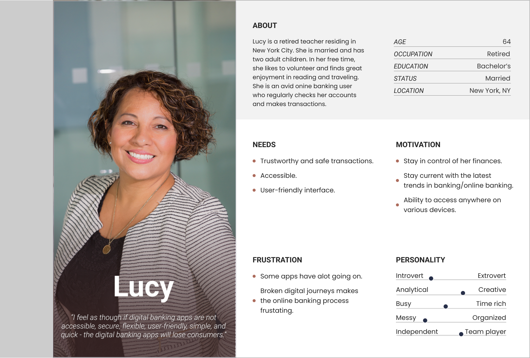
Kathy, 64 | Retired | Lives in New York City
"I'm very concerned with security and I don't necessarily trust online banking."
Jean, 69 | Store Owner| Lives in New York City
"I like having options. "
Findings
USERS WANTS
Friendly user interface
A simpler way to complete task
Peace of mind with a secure experience
Accessibility
Hypothesis
Users want a simple and easy-to-use interface that meets and fulfills their needs.
We will know this to be true once they complete task and are satisfied with process.
THEIR MOTIVATIONS
Sensible digital journeys
Human touch element
DEFINE
The Persona
Synthesizing the research into a set of deliverables, this will help in keeping the users as a priority in the design process. From this information, a persona was created to further address concerns, wants and needs.
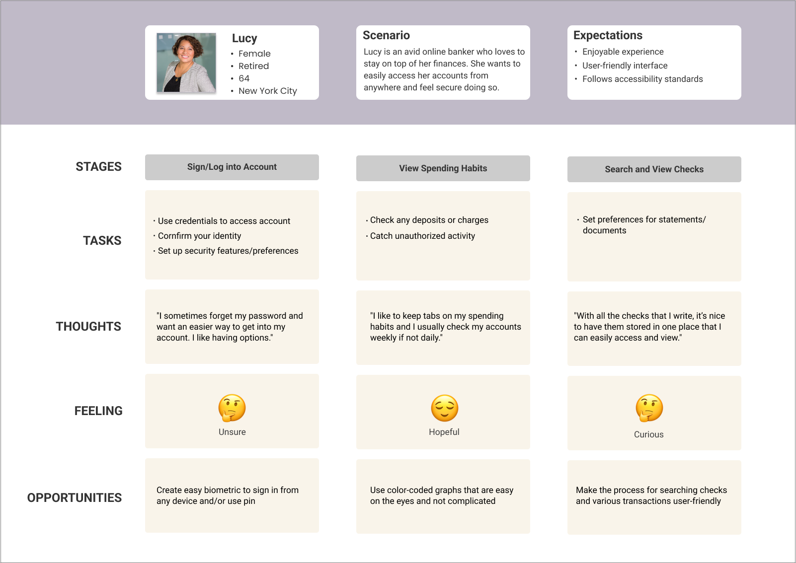
User Journey Map
Using data to correlate how users felt during their experience and then take measures to alter key points in the journey to make it more pleasant for future users.
Proposed Solutions
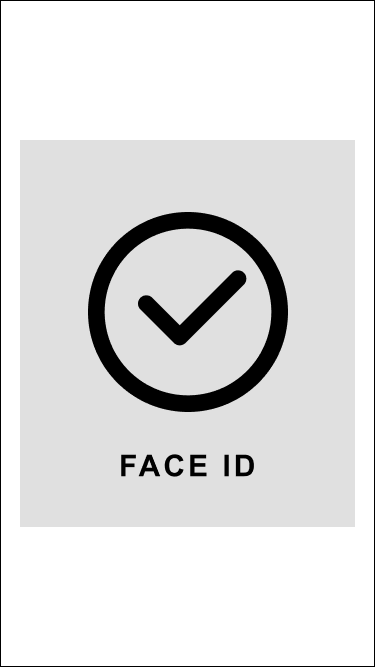
Create reliable biometric to make the log in/sign in process an option to access accounts.
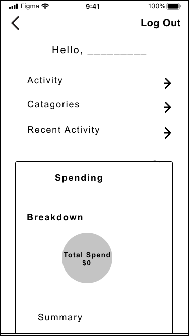
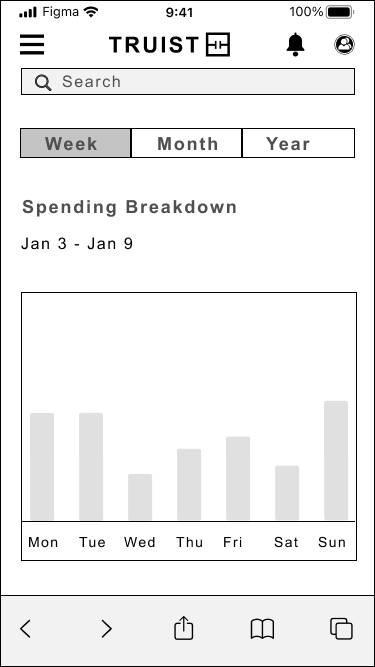
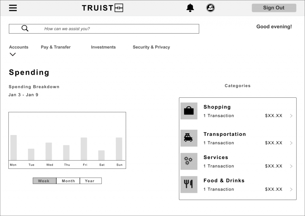
Use easy-to-understand daily, weekly, monthly, and annual graphs with a breakdown of spending habits and as well as annual so the user can easily refer.
Make searching for transactions user-friendly and less of a pain point for users by not having a lot of steps.
IDEATE
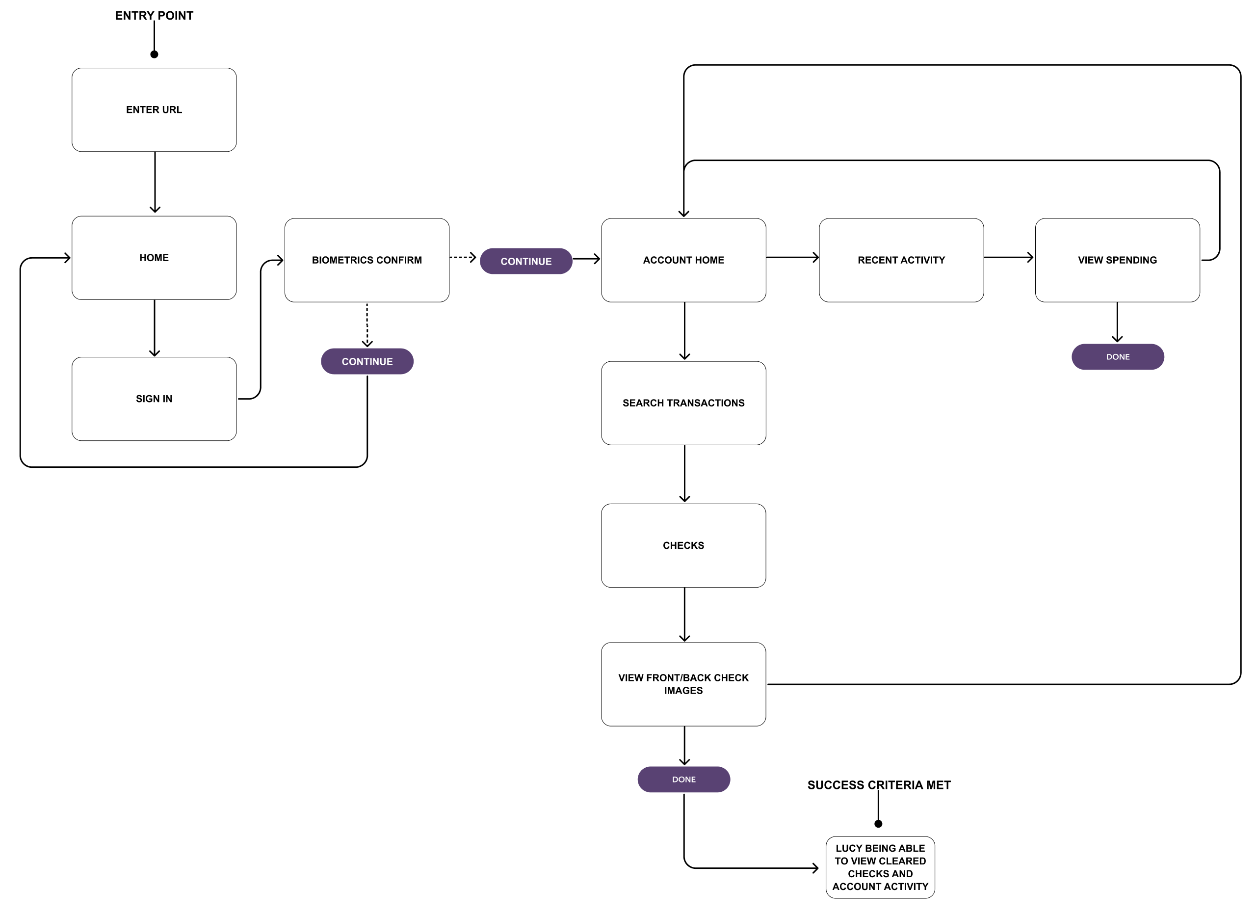
User Task Flow
I created a task flow to illustrate how the user will accomplish a task, from signing in to adding a viewing spending, and how they will interact with the product.
“As a frequent digital banking user, I want to be able to see various activities that are happening on my account and view checks so that I can keep tabs on my spending behavior.”
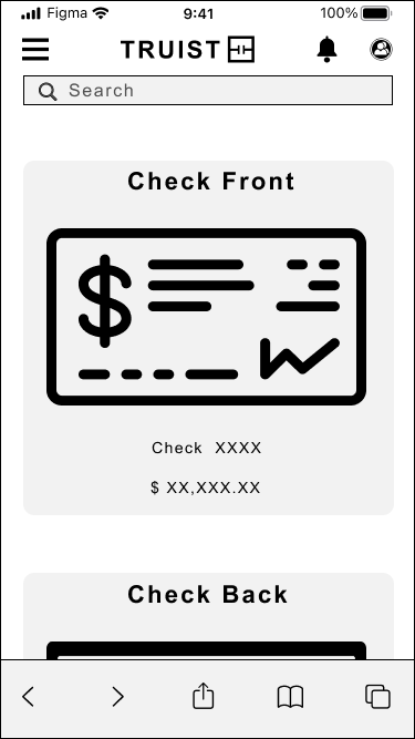
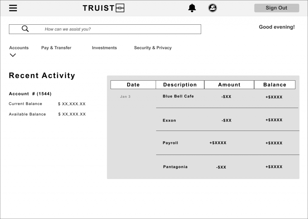
VIEW SPENDING & CLEARED CHECKS
Wireframes (Lo & Mid Fidelity)
Both low and mid-fidelity wireframes of viewing spending and checks were created to show the layout of the application. The interface elements were continuously improved through a continuous iteration process.
*LOW FIDELITY
The first step in my design process is creating low-fidelity wireframes ensuring and getting a clear understanding of the functionalities and designs to support.
VIEW SPENDING & CHECKS
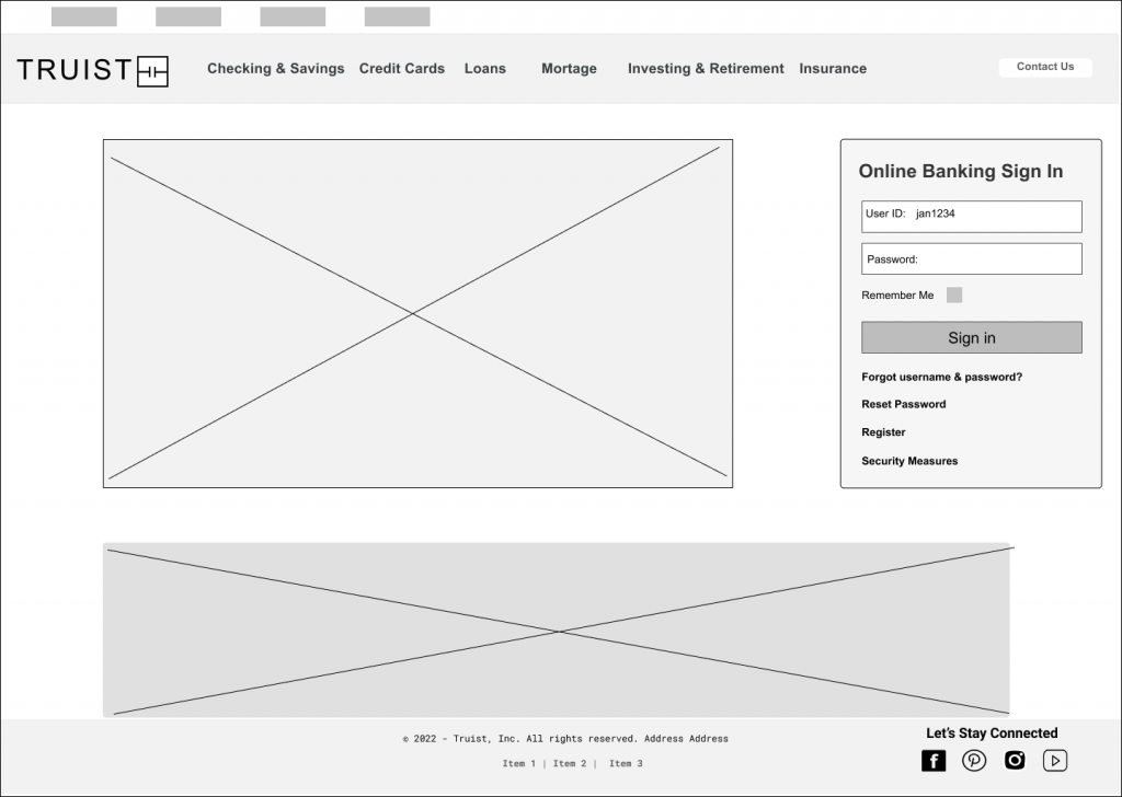
*DESKTOP
Usability Tests & Results #1
The usability test’s goal is to uncover flaws and things that are not straightforward in the designs. Participants were asked to perform a series of tasks while observing them and making notes.
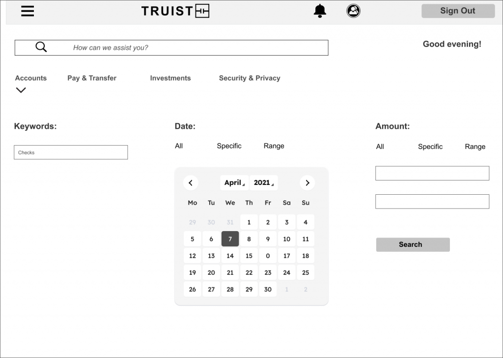
PAIN POINT
Users noted that specific range and range are great but having a calendar to choose dates.
SOLUTION
Add a calendar where users can choose a date or dates to search/view transactions or checks.
*MID FIDELITY
More copy and details are added.
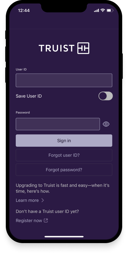
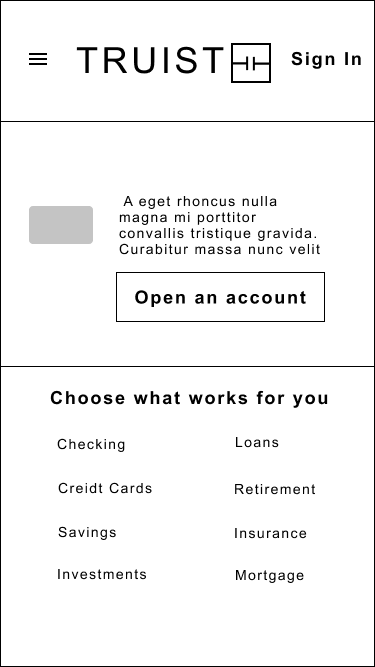
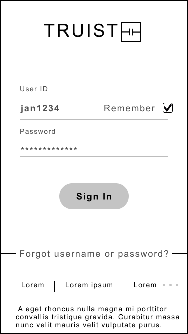
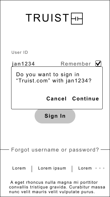
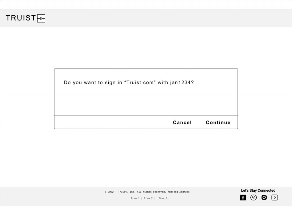
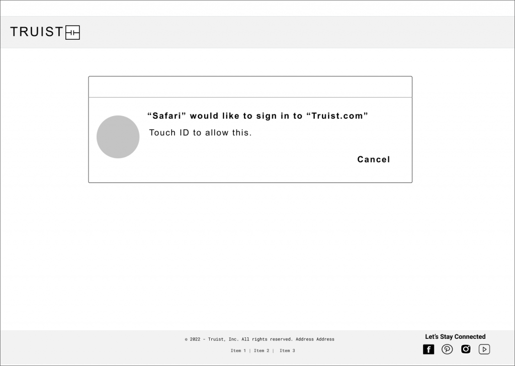
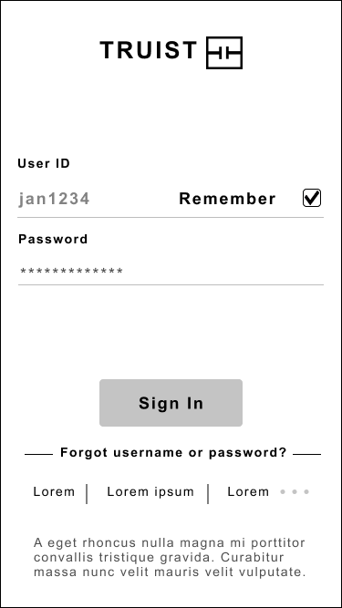
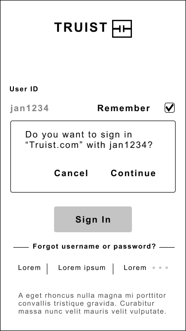
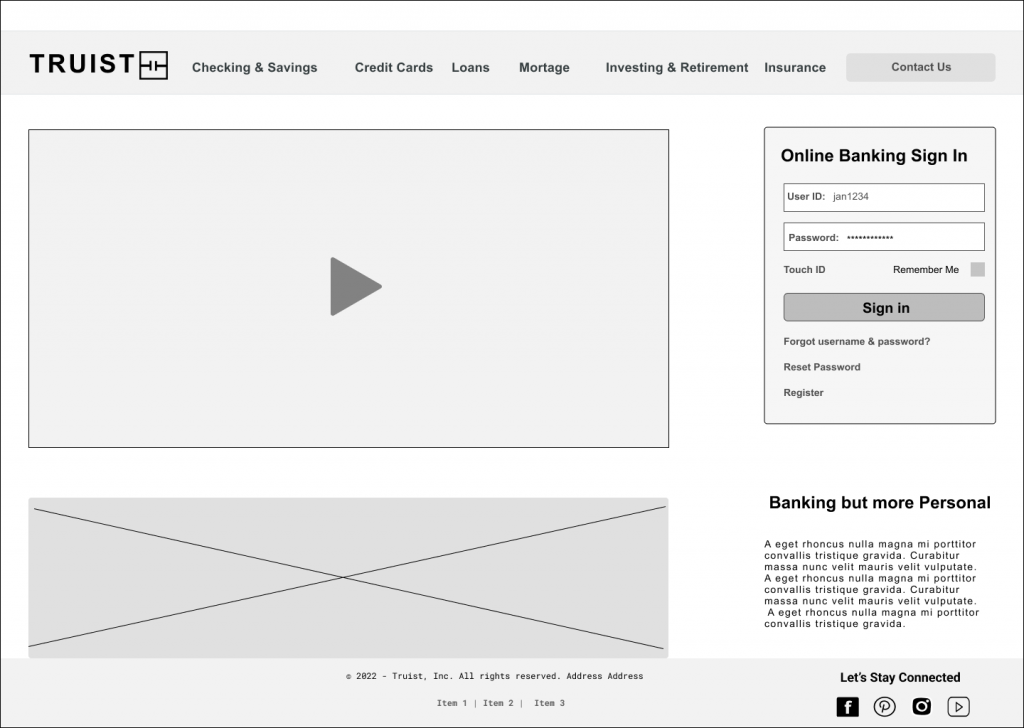
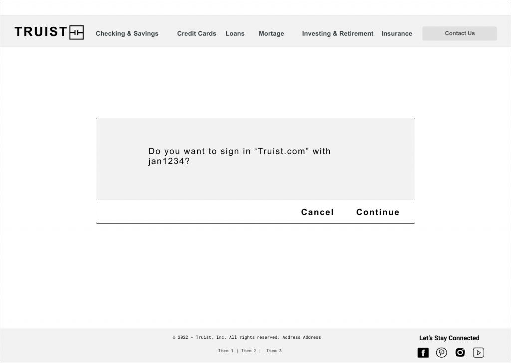
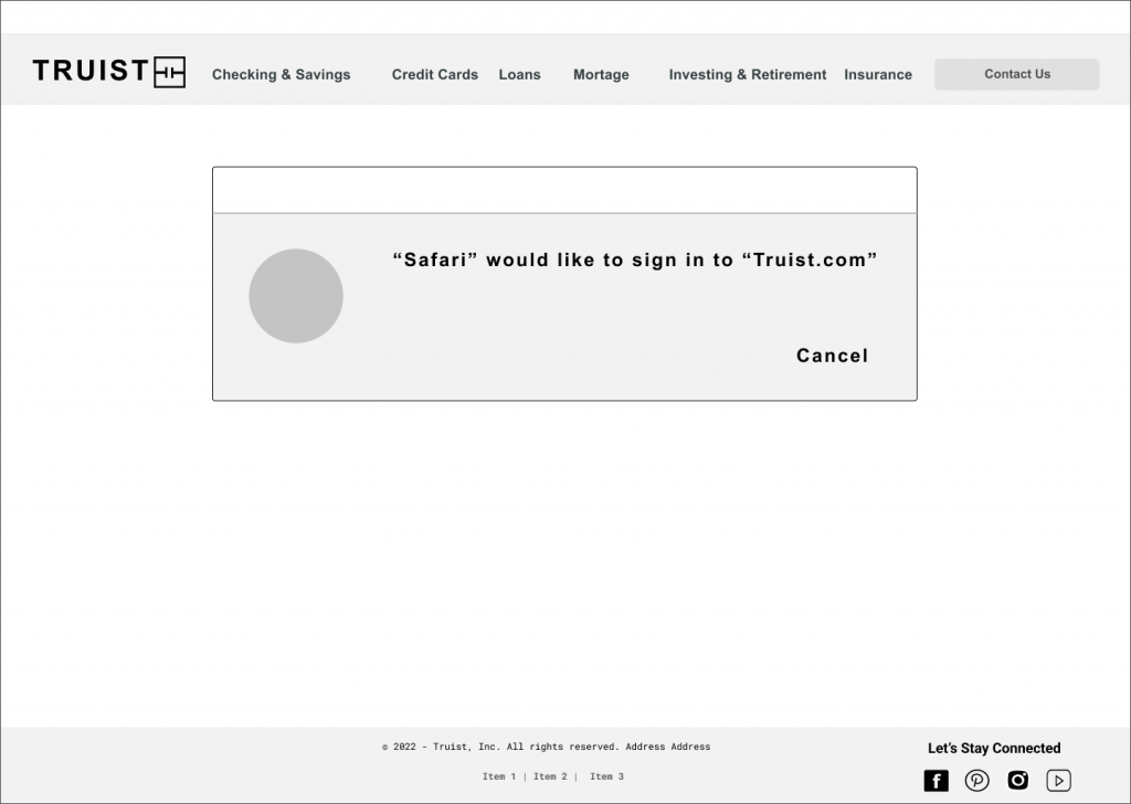
Sign in and Biometric
Options to sign into account.
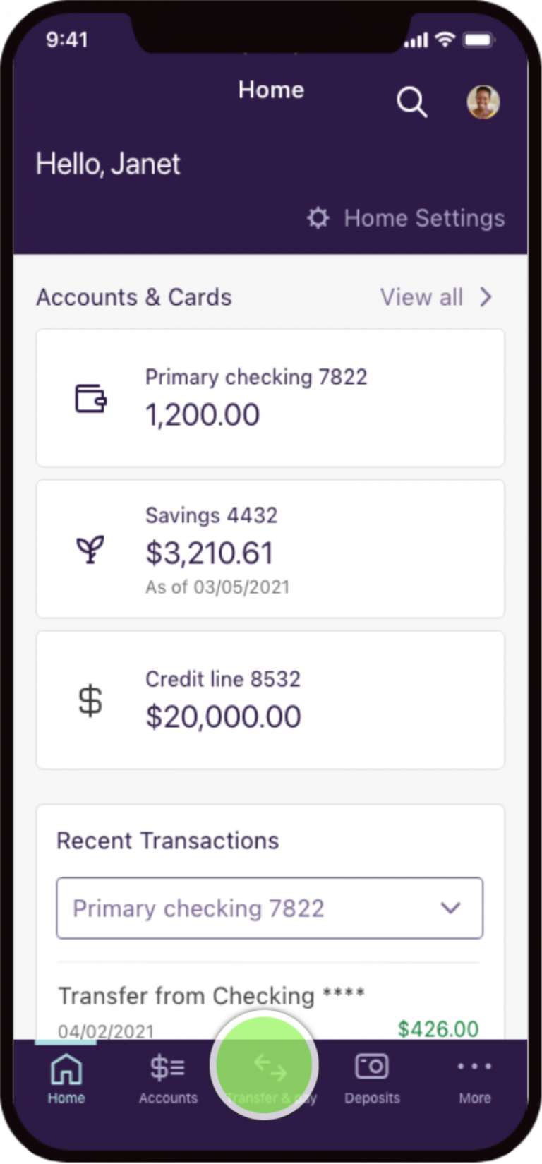
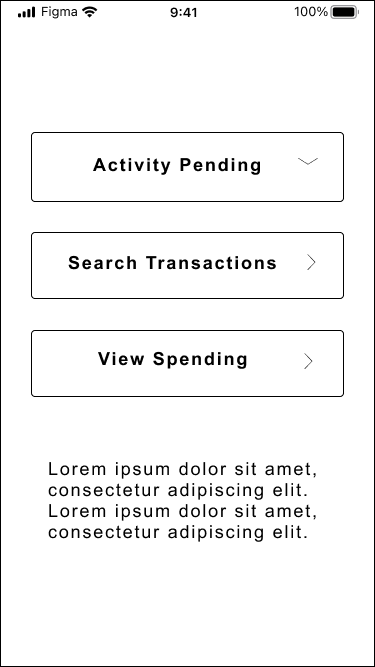
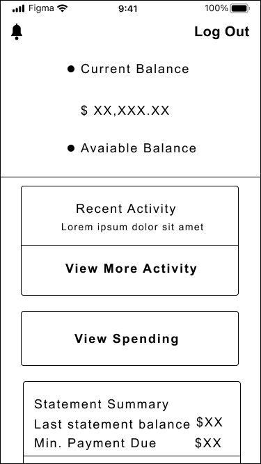
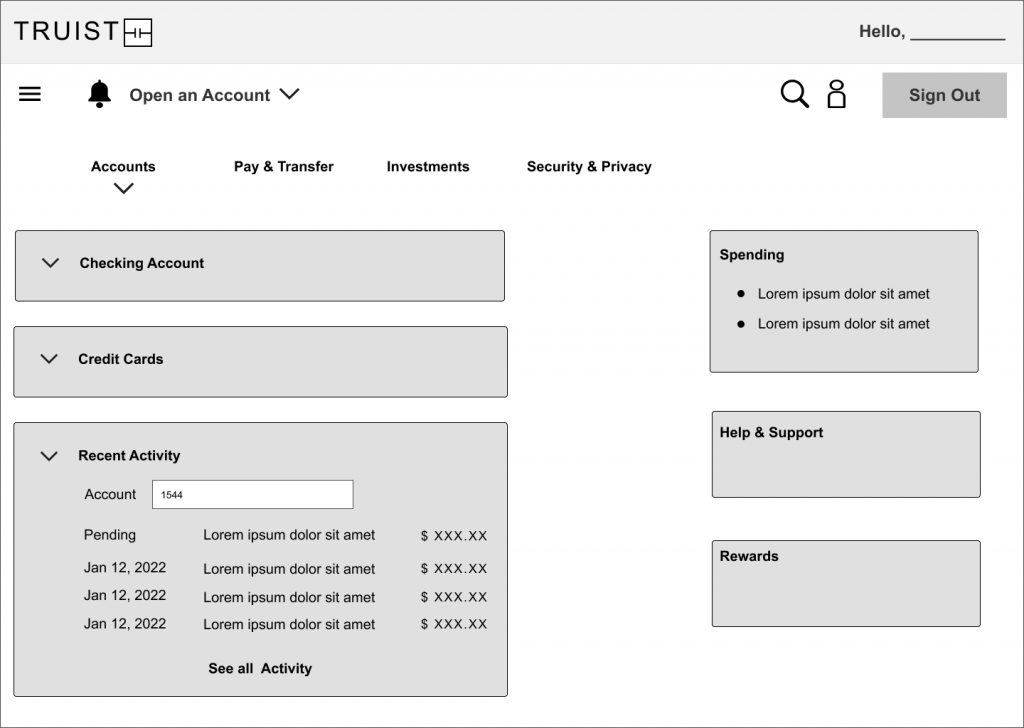
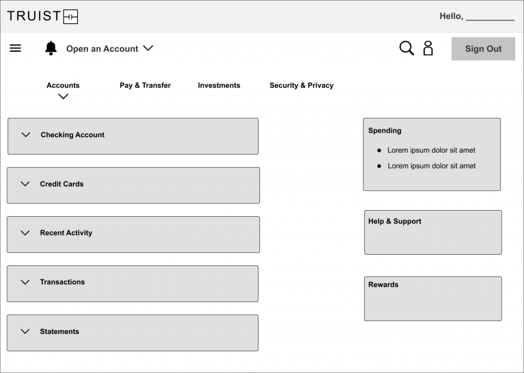
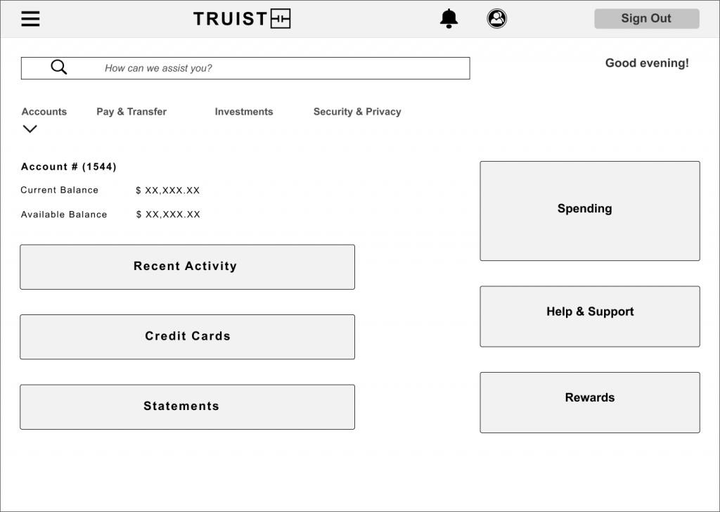
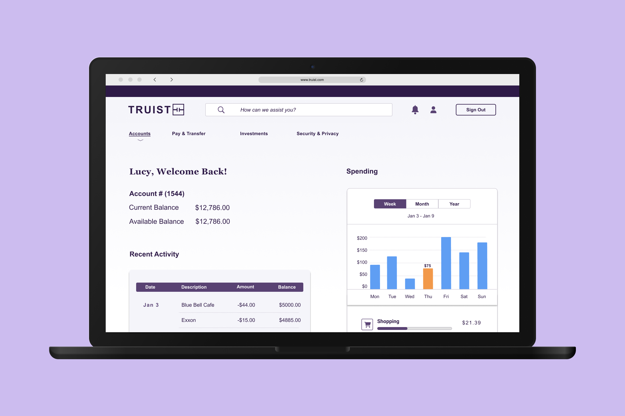
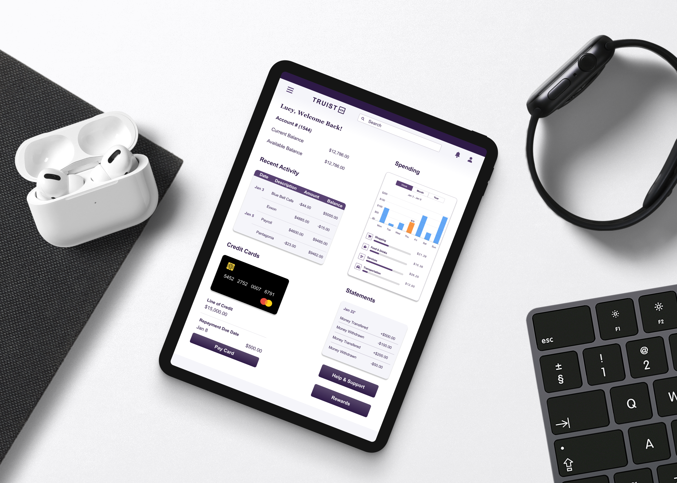
View Spending
Users have the option to view weekly, monthly or yearly spending.
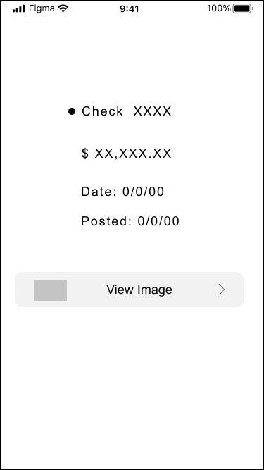
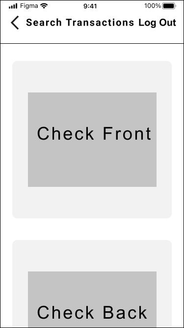
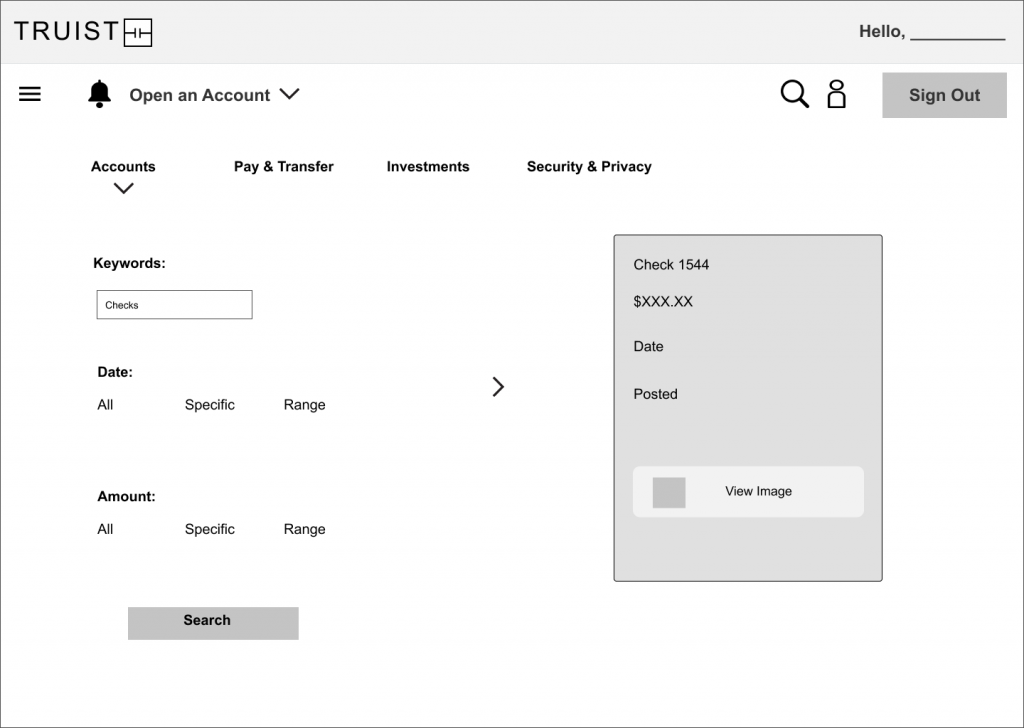
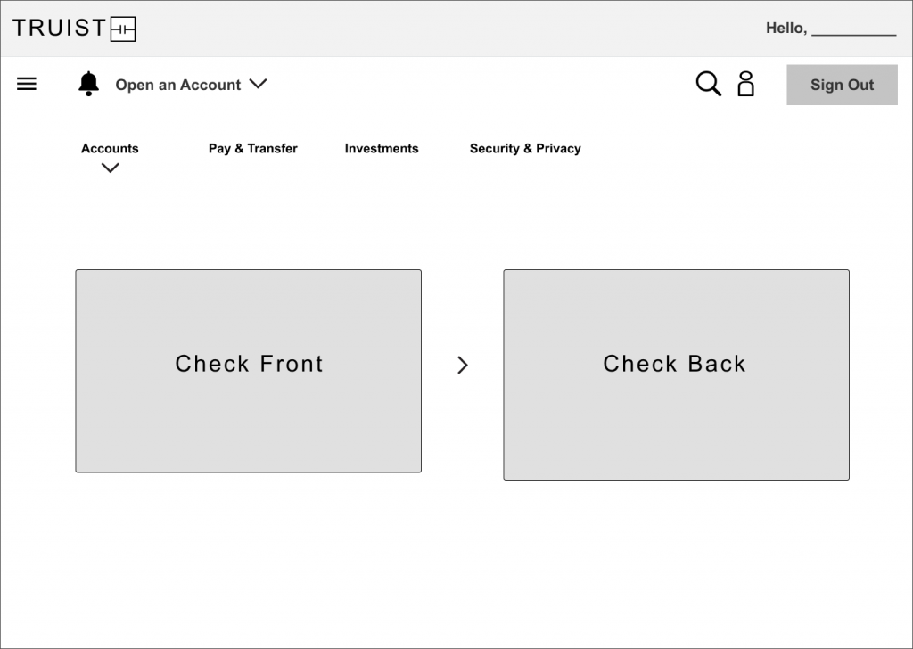
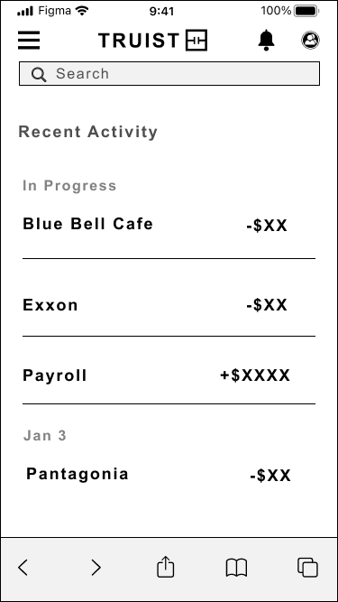
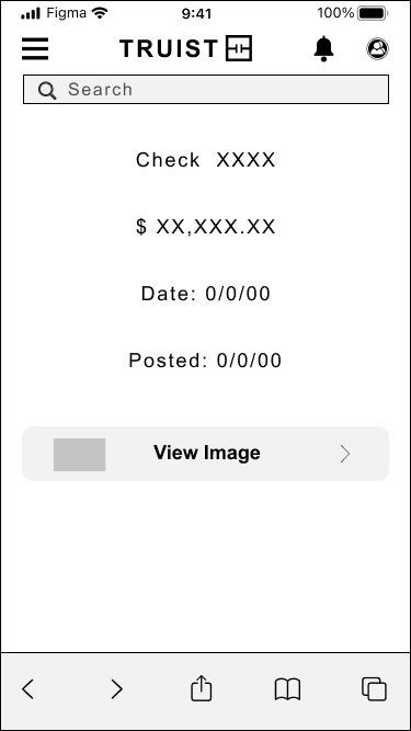
Search Transactions and View Checks
The user can search transactions and view checks from any time period.
*DESKTOP
Usability Tests & Results #2
Creating another iteration, we asked participants to complete a set tasks to see what further improvements need to be made on the redesign.
PAIN POINT
Participants noted for the spending habits, having a more detailed history as to where money is being spent.
SOLUTION
Created a breakdown of spending habits by including a detailed graph and showcasing common spending categories.
Setting the Tone
A Mood board was implemented to organize the redesign project’s inspiration, create style and aesthetic consistency, and to refine the redesign before diving into the actual design process.
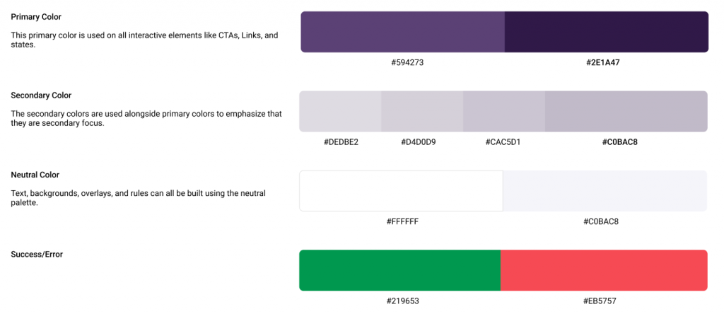
Truist fashions a signature color (purple) that stands out as:
Rich
Bold
Distinctive
Creative
These redesign images are airy, simple, human, and personable to create a sense of independence/self-suffenciency which is the theme for the redesign project.
MOOD BOARD
PROTOTYPE
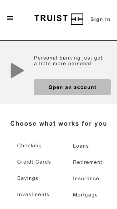
Hi Fidelity Prototype
After receiving feedback from the usability testing as well as getting inspiration from a mood board, I was able to create the look and feel and add the subtleties of the redesign.
Usability Tests & Results
PAIN POINT
Participants noted that the dark purple throughout the application made it difficult on the eyes to read.
SOLUTION
Keeping the same color scheme, the decision was made to lighten the purple and make it a bit more airy throughout.
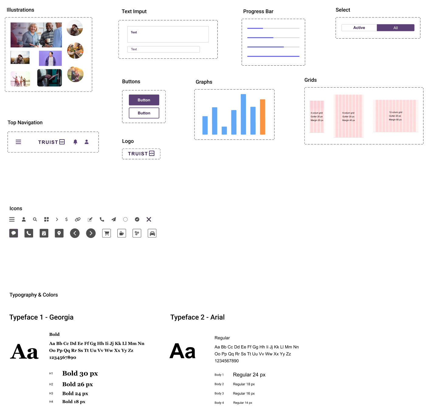
DESIGN SYSTEM
For this student project, a design system was already in place as this is a redesign.
RETROSPECTIVE
What Was Learned
Mood boards are a valuable tool not only for inspiration but in communicating with clients and team members in regards to the design direction.
Color can set the basic mood, tone, concept, and connotation for a brand or product.
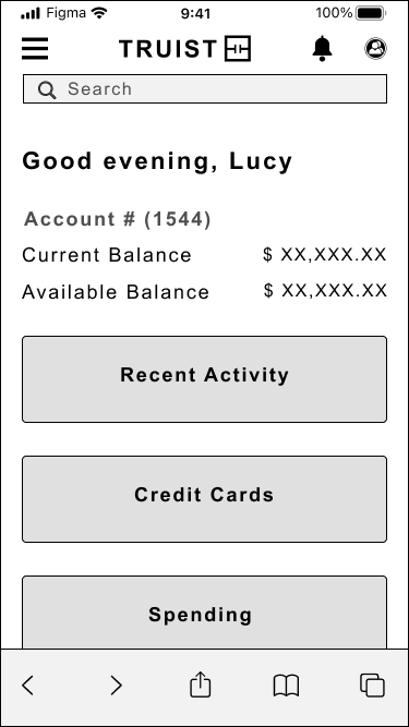
The goal of this redesign is to create a platform where users (such as the persona, Lucy) can easily access her secure account and view spending habits in a way that is not complicated. By turning Lucy’s frustrations into trustworthiness, I believe the goal of this project is met.
What Next
Keep the simplicity of the application and continue to make the interface accessible to to reach wider audiences.